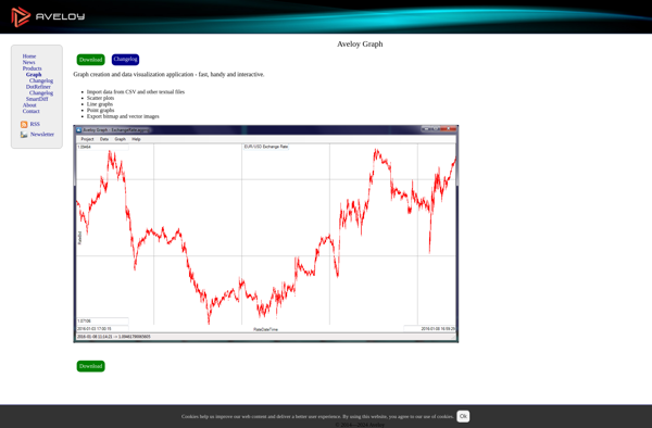
Aveloy Graph
Description: Aveloy Graph is a no-code business intelligence analytics and visualization software for building interactive dashboards. It enables users to connect data, create charts and metrics, build dashboard layouts, and share analytics through an intuitive drag-and-drop interface without coding.
Type: software
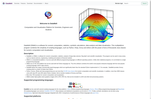
DataMelt
Description: DataMelt is an open-source data analysis and visualization platform. It allows importing, cleaning, transforming, analyzing, visualizing and publishing scientific data with an intuitive graphical workflow editor interface.
Type: software
Pricing: Open Source