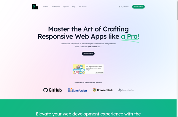
Responsively
Description: Responsively is a web development tool that allows you to preview your website on multiple devices in real time. It displays your site across various screen sizes including desktop, tablet, and mobile displays, letting you test how content will appear on each device.
Type: software
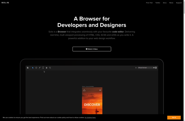
Solis
Description: Solis is an open-source operating system designed for use in network security appliances and routing platforms. It provides a hardened Linux environment focused on stability, security, and networking performance.
Type: software
Pricing: Open Source