Responsively
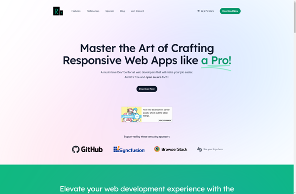
Responsively: Real-Time Web Development Tool
Responsively is a web development tool that allows you to preview your website on multiple devices in real time, ensuring seamless testing across desktop, tablet, and mobile displays.
What is Responsively?
Responsively is a web development tool used to test the responsiveness of a website. It allows web designers and developers to see how their website will appear on various devices and screen sizes in real time.
One of the main benefits of Responsively is that it displays your website across multiple screen sizes simultaneously. This includes previews for desktop, tablet, and mobile displays. As you make changes to your code, Responsively updates all of the previews in real time, allowing you to instantly see how adjustments impact the responsiveness of the site.
In addition to live previews, Responsively also comes equipped with developer tools like inspect and network monitoring. You can click elements on any of the screens to inspect the code and CSS behind them. There is also a network tab that shows all HTTP requests being made by the site.
Overall, Responsively streamlines web development workflows by consolidating essential testing and debugging features into one platform. The ability to preview a website across various devices makes it easy to build fully responsive sites that provide an optimal viewing experience for users, regardless of their screen size.
Responsively Features
Features
- Real-time previewing of website across multiple devices
- Supports desktop, tablet, and mobile screen sizes
- Customizable device layouts and orientations
- Automatic device synchronization
- Remote device debugging
- Code editor integration
- Screenshot capture and sharing
Pricing
- Free
- Freemium
- Subscription-Based
Pros
Cons
Official Links
Reviews & Ratings
Login to ReviewThe Best Responsively Alternatives
View all Responsively alternatives with detailed comparison →
Top Development and Web Development and other similar apps like Responsively
Here are some alternatives to Responsively:
Suggest an alternative ❐
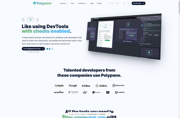
Polypane
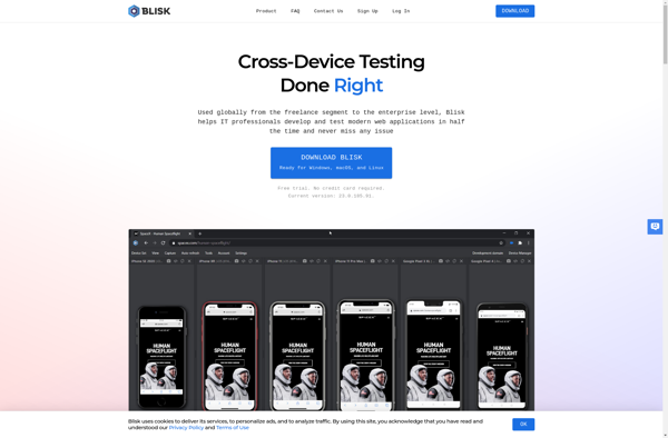
Blisk
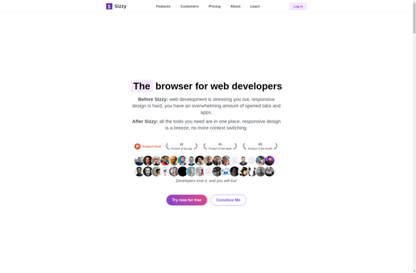
Sizzy
Responsinator

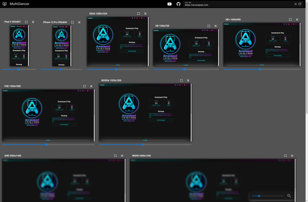
MultiGlancer
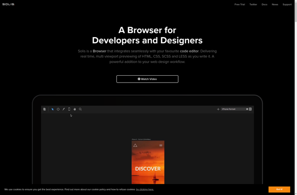
Solis