Responsinator

Responsinator: Test Website Responsiveness
Free online tool to test website responsiveness across various screen sizes, including desktops, tablets, and phones, for a better user experience on different devices.
What is Responsinator?
Responsinator is a free online responsiveness testing tool for web designers and developers. It allows you to enter the URL of a website and preview it across various simulated device screens to test the responsiveness of the design.
With Responsinator, you can test a site on different desktop, tablet, and mobile screens sizes to see how the site's layout and elements adapt or respond on different devices. It supports screening resolutions for common devices like iPhones, iPads, Android phones and tablets, and more.
Some key features of Responsinator include:
- Quickly testing the responsiveness of website designs without needing to manually resize a desktop browser
- Previewing sites across 10+ simulated screens like iPhone, full HD desktop screens, etc.
- Easily identifying elements that overlap, wrap, or get cut off on smaller screens
- Testing sites that require scrolling to see adaptability across viewports
- Checking hard-to-replicate device orientations like portrait and landscape modes
- Testing locally before publishing site changes live
- Collaborating with teammates by sharing generated test links
Responsinator is very easy to use - simply enter a URL to see the responsive tests. It's an invaluable tool for web designers and developers to make sure sites provide an optimal viewing and interaction experience across devices. With its free and simple web-based interface for responsiveness testing, Responsinator helps build better responsive websites.
Responsinator Features
Features
- Preview website on various screen sizes
- Supports desktop, tablet, and mobile device sizes
- Responsive design testing
- Customizable device sizes
- Responsive layout visualization
Pricing
- Free
Pros
Cons
Official Links
Reviews & Ratings
Login to ReviewThe Best Responsinator Alternatives
View all Responsinator alternatives with detailed comparison →
Top Web Browsers and Website Testing and other similar apps like Responsinator
Here are some alternatives to Responsinator:
Suggest an alternative ❐
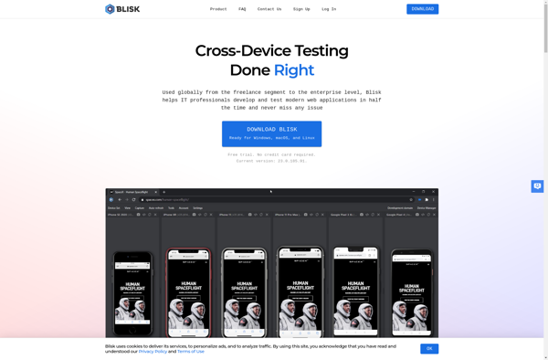
Blisk
Responsively

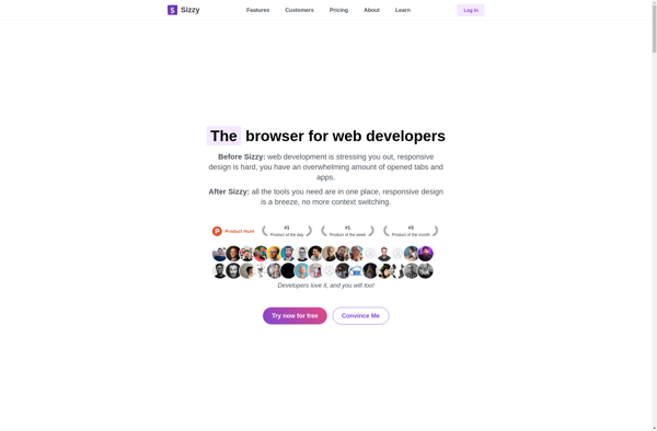
Sizzy
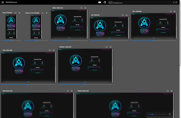
MultiGlancer