Sizzy
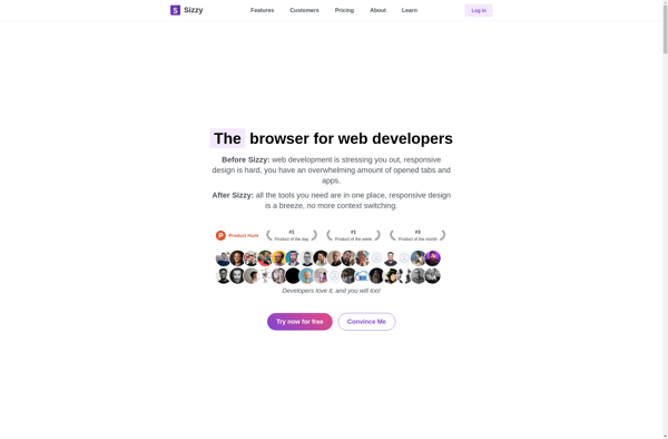
Sizzy: Browser Tool for Responsive Design Previews
Web developer and designer tool to preview websites on multiple devices simultaneously, facilitating responsive design building.
What is Sizzy?
Sizzy is a lightweight browser extension tool for web developers and designers to preview and test responsive website designs across various device sizes and viewports. It displays rezisions of the website side-by-side on different simulated device screens like desktop, tablet, and mobile.
This allows developers to visualize how their website will adapt and reflow content across screen sizes in real time as they build. They can toggle between device options like iPhone, iPad, desktop browser dimensions, etc. to ensure website elements resize, stack, and function properly on all formats the site needs to support.
Some key features include:
- Preview mobile/tablet/desktop versions simultaneously
- Customize viewport dimensions
- Toggle between device types
- Test on actual mobile devices with mobile mirroring
- Annotate designs and share feedback
- Monitor CSS media queries
- Easy integration into dev workflows
Sizzy takes manual resizing and guessing out of responsive web design. Instead of needing multiple physical devices, the tool brings emulated versions together to let teams build truly adaptive sites that provide optimal viewing and interaction for any device. This saves significant QA and testing time later.
Sizzy Features
Features
- Real-time responsive preview across multiple devices
- Device emulation with various screen sizes and orientations
- Live code editing and instant updates
- Automatic device synchronization
- Screenshot and recording capabilities
- Customizable device layouts and grid views
- Integrated browser developer tools
Pricing
- Free
- Subscription-Based
Pros
Cons
Official Links
Reviews & Ratings
Login to ReviewThe Best Sizzy Alternatives
View all Sizzy alternatives with detailed comparison →
Top Development and Web Development and other similar apps like Sizzy
Here are some alternatives to Sizzy:
Suggest an alternative ❐
Polypane
Blisk
Responsively
Responsinator
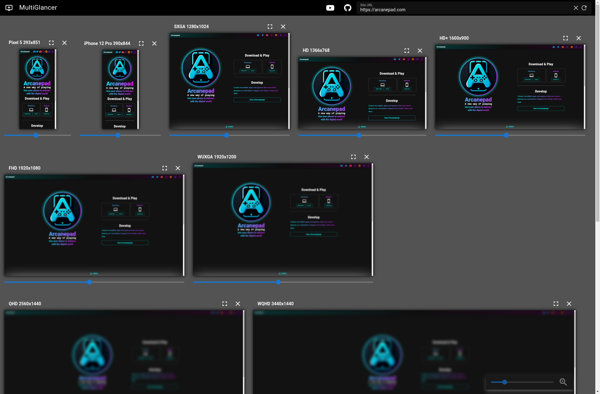
MultiGlancer