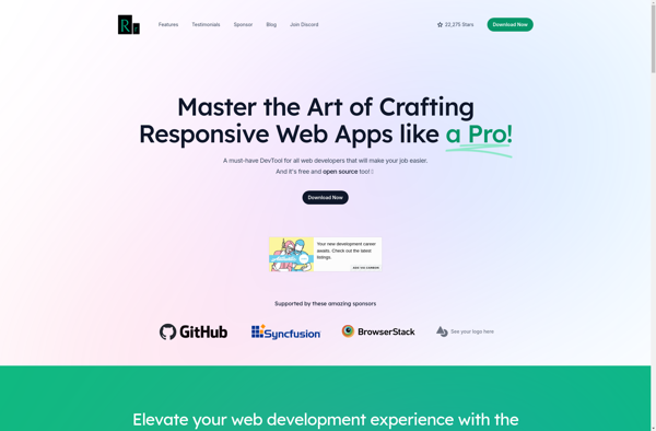
Responsively
Description: Responsively is a web development tool that allows you to preview your website on multiple devices in real time. It displays your site across various screen sizes including desktop, tablet, and mobile displays, letting you test how content will appear on each device.
Type: software
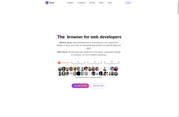
Sizzy
Description: Sizzy is a browser tool that allows web developers and designers to preview their websites on multiple device sizes simultaneously. It displays rezisions of the website on different device viewports like desktop, tablet, and mobile to help build responsive designs.
Type: software