Struggling to choose between Tableau and RAWGraphs? Both products offer unique advantages, making it a tough decision.
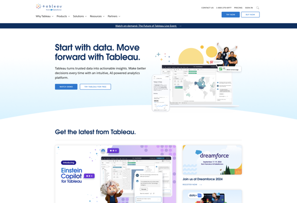
Tableau is a Business & Commerce solution with tags like data-visualization, business-intelligence, dashboards, data-analysis.
It boasts features such as Drag-and-drop interface for data visualization, Connects to a wide variety of data sources, Interactive dashboards with filtering and drilling down, Mapping and geographic data visualization, Collaboration features like commenting and sharing and pros including Intuitive and easy to learn, Great for ad-hoc analysis without coding, Powerful analytics and calculation engine, Beautiful and customizable visualizations, Can handle large datasets.
On the other hand, RAWGraphs is a Data Visualization product tagged with data-visualization, charts, graphs, spreadsheet, draganddrop.
Its standout features include Drag-and-drop interface for creating visualizations, Supports various chart types like bar charts, scatter plots, dendrograms, chord diagrams, Allows importing data from CSV and Excel files, Customizable colors, fonts, sizes for all elements, Ability to export visualizations as SVG, PNG, PDF, Web-based so works across platforms and devices, Open source and free to use, and it shines with pros like Intuitive and easy to use, Very flexible and customizable, Supports many visualization types, Free and open source, Works on any device with a browser.
To help you make an informed decision, we've compiled a comprehensive comparison of these two products, delving into their features, pros, cons, pricing, and more. Get ready to explore the nuances that set them apart and determine which one is the perfect fit for your requirements.
Tableau is a popular business intelligence and data visualization software. It allows users to connect to data, create interactive dashboards and reports, and share insights with others. Tableau makes it easy for anyone to work with data, without needing coding skills.
RAWGraphs is an open-source data visualization software that allows users to create a variety of charts and graphs from spreadsheet data. It has an intuitive drag-and-drop interface for easily customizing visualizations.