Struggling to choose between UIkit and Bulma? Both products offer unique advantages, making it a tough decision.
UIkit is a Development solution with tags like ui, framework, web, mobile, opensource.
It boasts features such as UI Components - Buttons, forms, tables, navigation, etc., Responsive Layout - Flexbox-based grid system and responsive components, Theming - Customizable theme with LESS/SASS support, Lightweight - Minimized codebase with minimal footprint, Modular - Components can be used independently or together, Accessible - Follows WAI-ARIA standards for accessibility, Documentation - Comprehensive docs with code examples, Customizable - Extendable and themeable with LESS/SASS, Cross-Browser - Works in all modern browsers and pros including Easy to learn and use, Good documentation and community support, Very customizable and extensible, Lightweight and fast, Follows web standards and accessibility guidelines, Supports responsive design well, Components work well together, Active development and maintenance.
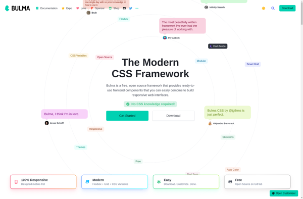
On the other hand, Bulma is a Development product tagged with css, frontend, flexbox, responsive, web-design.
Its standout features include Modular design, Mobile-first approach, Flexbox-based responsive layout, SASS source files, Customizable with CSS variables, Lightweight and fast, and it shines with pros like Easy to learn and use, Good documentation, Open source and free, Small file size, Flexibility and customizability, Active community support.
To help you make an informed decision, we've compiled a comprehensive comparison of these two products, delving into their features, pros, cons, pricing, and more. Get ready to explore the nuances that set them apart and determine which one is the perfect fit for your requirements.
UIkit is an open-source web framework for developing fast and powerful web interfaces. It provides a collection of HTML, CSS, and JS components to build responsive, mobile-first websites and apps.
Bulma is an open source CSS framework that provides ready-to-use frontend components that you can easily combine to build responsive web interfaces. Its design is based on Flexbox and it aims to provide an alternative to Bootstrap.