Contrast – Color Accessibility

Contrast - Color Accessibility Tool
A color accessibility tool analyzing text and background colors to ensure WCAG contrast ratio standards, aiding designers in choosing readable colors.
What is Contrast – Color Accessibility?
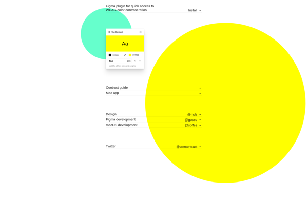
Contrast is a software tool focused on checking color accessibility and contrast. It analyzes combinations of foreground and background colors to determine if they meet accessibility standards for contrast ratios. This helps designers choose color palettes that work for all users, including those with visual impairments.
Specifically, Contrast checks if text and background colors have sufficient contrast to meet Level AA and Level AAA standards from the Web Content Accessibility Guidelines (WCAG). These guidelines recommend at least 4.5:1 contrast for normal text and 3:1 for large text. Contrast makes it easy to test color combinations to ensure text remains readable.
By entering hex codes or using the color picker, designers can check contrast ratios for their own color choices. Contrast provides a clear pass/fail rating on whether a color combination meets contrast standards. If a color combo fails, Contrast suggests accessible alternatives from its database of color palettes. This helps designers learn how to choose accessible colors.
With its focus specifically on color and contrast, Contrast integrates nicely into designer workflows. It helps ensure websites and apps are usable for all readers, including those with visual disabilities. Overall, Contrast aims to promote accessibility and design for all through better color choices.
Contrast – Color Accessibility Features
Features
- Checks color contrast ratios
- Analyzes entire screens or user-selected elements
- Shows contrast ratios and passes/fails
- Suggests accessible color alternatives
- Integrates with Sketch, Figma, Adobe XD, etc
Pricing
- Freemium
- Subscription-Based
Pros
Cons
Official Links
Reviews & Ratings
Login to ReviewNo reviews yet
Be the first to share your experience with Contrast – Color Accessibility!
Login to ReviewThe Best Contrast – Color Accessibility Alternatives
View all Contrast – Color Accessibility alternatives with detailed comparison →
Top Accessibility and Color Contrast and other similar apps like Contrast – Color Accessibility
Here are some alternatives to Contrast – Color Accessibility:
Suggest an alternative ❐Pikka

Color Picker Pro

Contraste
