Picnic CSS
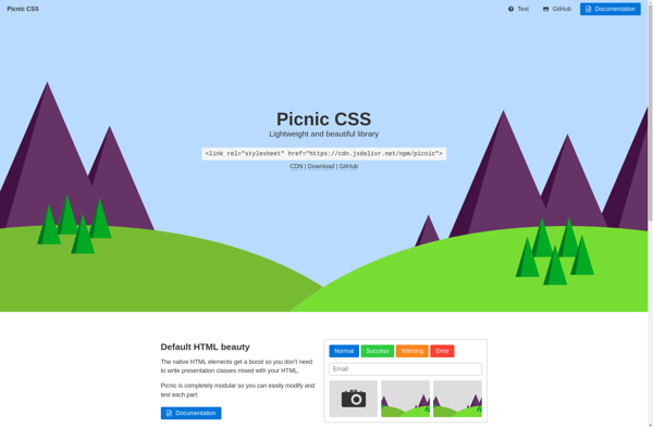
Picnic CSS: Minimalist CSS Framework for Fast Responsive Websites
A lightweight CSS framework providing basic styled layout, typography styles, grid system, components and utility styles for fast and responsive website development.
What is Picnic CSS?
Picnic CSS is an open-source CSS framework that focuses on simplicity, minimal code, and ease of use. It provides basic styling and components to quickly build websites and web applications without complex setup.
Some key features and benefits of Picnic CSS:
- Lightweight at only 5KB minified and gzipped
- Mobile-first responsive design
- 12-column flexbox grid system
- Common UI components like buttons, forms, tables etc.
- 60+ utility classes for spacing, typography, colors etc.
- Syntax highlighting and code blocks
- Customizable with SASS source files
- No JavaScript required
Picnic CSS works right out of the box by simply adding one CSS file into your HTML. It is great for hackathons, prototypes, CMS-based sites, blogs and more. The simplicity makes it easy to override and extend styles to match your design needs.
Picnic CSS Features
Features
- Lightweight at ~5KB gzipped
- Mobile-first and responsive design
- Basic UI components like buttons, forms, tables etc
- Flexbox-based grid system
- Utility classes for colors, spacing, display, sizing etc
- Supports modern browsers
Pricing
- Open Source
Pros
Cons
Official Links
Reviews & Ratings
Login to ReviewThe Best Picnic CSS Alternatives
View all Picnic CSS alternatives with detailed comparison →
Top Development and Css Frameworks and other similar apps like Picnic CSS
Here are some alternatives to Picnic CSS:
Suggest an alternative ❐
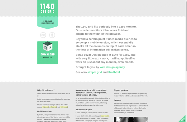
1140 CSS Grid
Google Web Starter Kit