1140 CSS Grid
1140 CSS Grid: Open-Source Responsive Grid Framework
1140 CSS Grid is an open-source CSS framework that provides a responsive grid system to build websites. It contains templates, code snippets, and useful guidelines to create layouts easily.
What is 1140 CSS Grid?
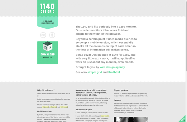
1140 CSS Grid is an open-source CSS framework created by Andy Taylor to help web designers and developers quickly build responsive websites. It contains a 12-column responsive grid that adapts to various screen sizes and devices. Some key features of 1140 CSS Grid include:
- Lightweight and optimized for speed
- Responsive 12-column grid down to mobile sizes
- Typography templates for easy formatting
- Helpers for forms, buttons, clearfix etc.
- Easy to customize - add your own CSS
- Works well alongside other frameworks
- Free to use under MIT License
The number 1140 refers to the maximum width the grid layout can extend up to. At widths below 1140px, the grid fluidly resizes itself. This framework emphasizes designing for the content first. The grid adapts itself based on the content rather than forcing content to fit the grid.
The responsive templates, meaningful class names like header, footer, container etc. make it convenient for developers to build websites of all complexities quickly. The focus remains on coding and not battling CSS issues. Most common CSS tasks have Mixins written that can simply be reused. It has detailed documentation on how to customize and extend the framework.
1140 CSS Grid Features
Features
- Responsive 12-column grid system
- Flexbox support
- Nested grid system
- SASS variables for easy customization
- Mixins for generating columns
- Media queries for responsive breakpoints
- Default typography styles
- Helper classes for spacing, hiding content, etc.
Pricing
- Open Source
Pros
Cons
Official Links
Reviews & Ratings
Login to ReviewThe Best 1140 CSS Grid Alternatives
View all 1140 CSS Grid alternatives with detailed comparison →
Top Development and Css Frameworks and other similar apps like 1140 CSS Grid
Here are some alternatives to 1140 CSS Grid:
Suggest an alternative ❐
GroundworkCSS
Purecss
Skeleton
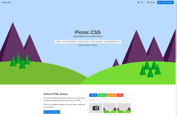
Picnic CSS
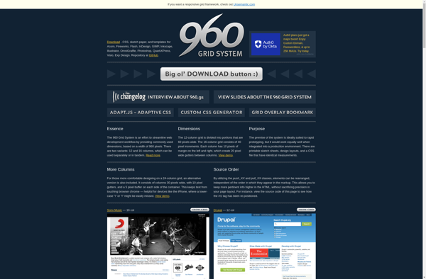
960 Grid System
The Goldilocks Approach
Golden Grid System
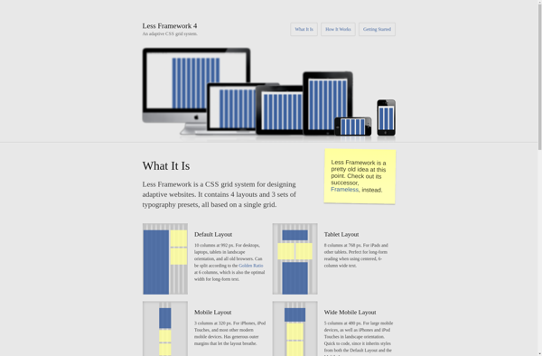
Less Framework
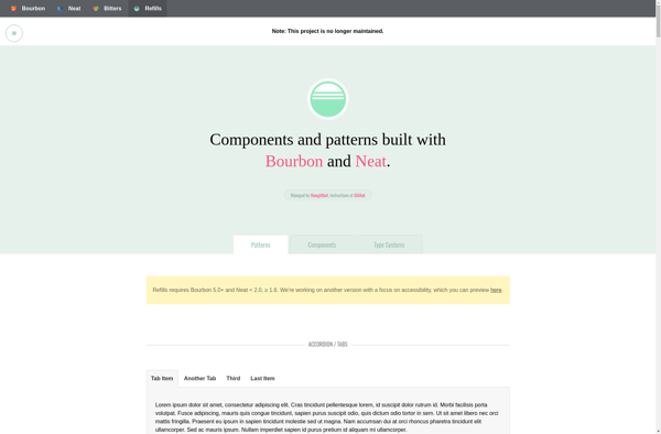
Refills
Responsable
320 and Up