Skeleton is a simple, responsive boilerplate that can be used as a lightweight starting point for web development projects. It provides basic CSS and JS functions for rapid prototyping.
Simple, responsive boilerplate for rapid prototyping with basic CSS and JS functions
What is Skeleton?
Skeleton is an open source, lightweight front-end framework for developing responsive web pages and apps. It's designed to be a starting point rather than a UI library like Bootstrap or Foundation.
Here are some key features of Skeleton:
Lightweight at just 400 lines of CSS
Fully responsive grid down to mobile devices
Syntax highlighting CSS styles for code
Support for basic UI elements like buttons, forms, tables etc.
Easily customizable - it's meant as a starting point
Includes media queries, mixins and other tools
Works well across modern desktop and mobile browsers
Because of its minimalist nature, Skeleton needs to be extended to build complex sites. It works best when you use it as the underlying grid and structure, and then add your own CSS or integrations with libraries like React or Vue.
Overall, Skeleton is great for rapid prototyping when you want a responsive grid system and basic styling but need a lightweight codebase. It reduces the amount of CSS and JS you need to write yourself.
Skeleton Features
Features
Responsive design
Lightweight and fast
Basic CSS and JavaScript functions
Easy to customize
Supports modern browsers
Pricing
Open Source
Pros
Simplicity and ease of use
Quick setup for rapid prototyping
Minimal dependencies
Cross-browser compatibility
Cons
Limited functionality compared to more feature-rich frameworks
May require additional plugins or libraries for complex projects
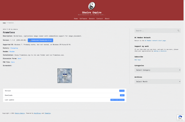
Frameless is an open-source website builder created as an alternative to services like Wix or Squarespace. It allows anyone to build professional looking websites without needing to know how to code.Some key features of Frameless include:Drag-and-drop visual editor to design and layout pagesCustomizable templates and themesIntegrations with platforms like WordPress...
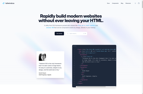
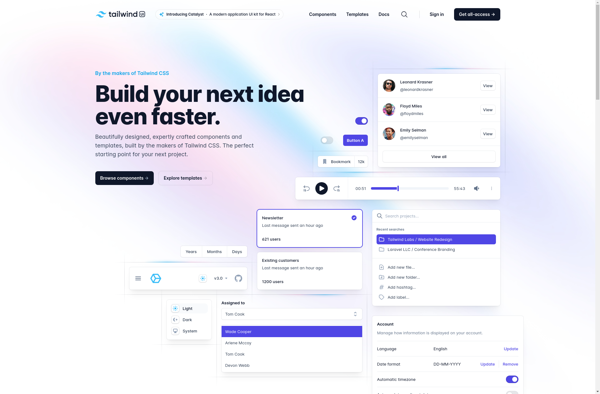
Tailwind CSS is an open-source CSS framework that takes a utility-first approach for building custom user interfaces. Instead of opinionated pre-designed components, Tailwind provides low-level utility classes for typical CSS properties like color, padding, font-size, etc. Developers can compose these atomic utility classes together to rapidly build out UI without...
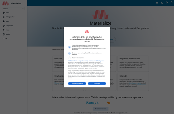
Materialize is an open-source front-end framework that helps web developers build responsive and mobile-first websites quickly. It is based on Google's Material Design principles and provides many user interface components out of the box to construct web pages, including:ButtonsCardsChipsFormsNavbarsGrid systemTablesModalsToastsAnd more...Developers can simply include the Materialize CSS and JavaScript files...
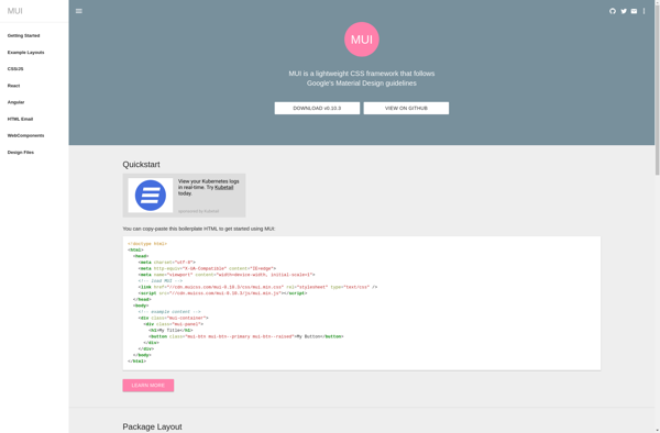
MUI (formerly Material UI) is an open-source React component library that implements Google's Material Design guidelines. It provides developers with hundreds of customizable and accessible UI components to help build user interfaces and web applications faster.Some key features and benefits of MUI include:Over 50 responsive and high-quality React components like...
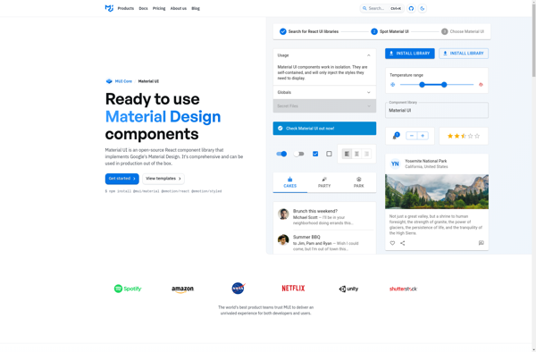
Material UI is an open-source React component library that implements Google's Material Design guidelines. It provides developers with a collection of reusable UI components that can be used to quickly build high-quality, responsive web applications.Some key features of Material UI include:Over 60 ready-made components like buttons, cards, menus, lists, etc.Responsive...
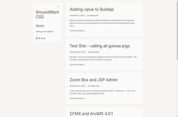
GroundworkCSS is an open-source CSS framework designed to streamline responsive web development. It offers a lightweight grid system for layouts that adapt across devices, along with predesigned UI components and styles for typography, forms, buttons, navigation bars and more.Some key features and benefits of GroundworkCSS include:Responsive 12-column grid with breakpoint...
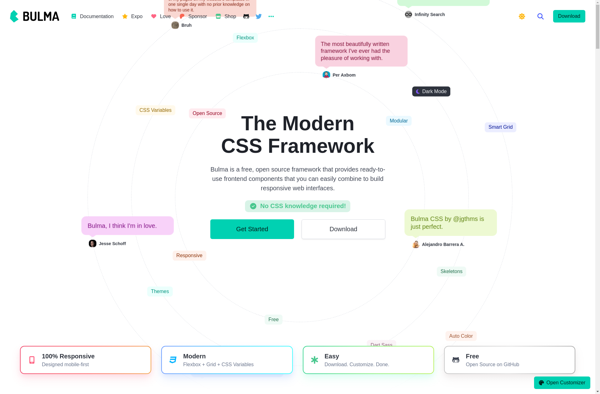
Bulma is an open source CSS framework that provides ready-to-use frontend components that you can easily combine to build responsive web interfaces. Its main advantages are:Based on Flexbox for layout, making it fully responsive by defaultElegant design with focus on typography and colorsExtensive documentation with many examplesLightweight at around 30KB...
Headless UI is an open-source, unstyled, and fully accessible UI component library for React apps. It was created by the team at Vercel to provide developers with ready-made React UI components that have full accessibility support built-in, but no visual styling.The key concept behind Headless UI is the separation of...
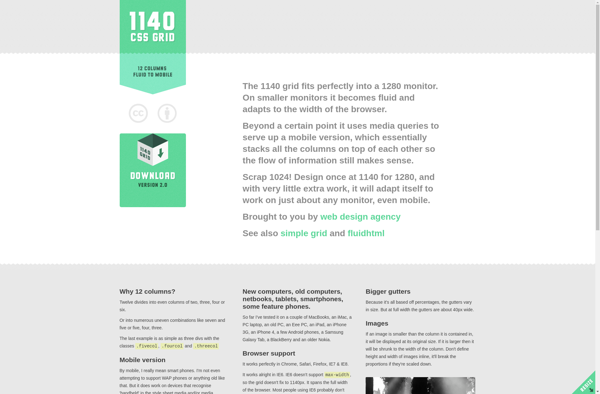
1140 CSS Grid is an open-source CSS framework created by Andy Taylor to help web designers and developers quickly build responsive websites. It contains a 12-column responsive grid that adapts to various screen sizes and devices. Some key features of 1140 CSS Grid include:Lightweight and optimized for speedResponsive 12-column grid...
UIkit is an open-source web framework for developing fast and powerful web interfaces. It provides a collection of reusable HTML, CSS, and JavaScript components that can be used to build responsive, mobile-first websites and applications.Some key features of UIkit include:An extensive library of pre-built components like typography, forms, tables, tabs,...
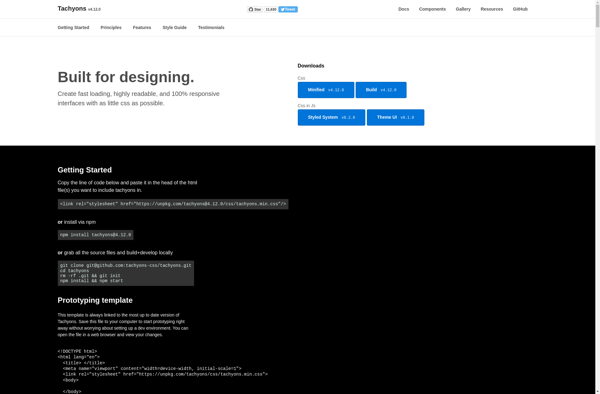
Tachyons is an open-source CSS framework created by Adam Morse. It takes a functional CSS approach by providing a library of single-purpose CSS classes from which developers can compose more complex UI styles.Unlike frameworks like Bootstrap that include many pre-designed UI components, Tachyons focuses only on atomic, low-level utility classes....
Flexbox Grid is an open-source CSS framework that provides a responsive grid system based on flexbox technology. It allows web developers to quickly create modern layouts and alignments for their web projects using familiar concepts like rows, columns, gutters, etc.Some key features of Flexbox Grid:Fully responsive - The grid adapts...
Tailwind UI is an extensive, open-source component library for Tailwind CSS created by the developers of Tailwind CSS itself. It features over 100 responsive HTML and React components and pages that can be used to accelerate development of web applications built with Tailwind.Some of the key features and benefits of...
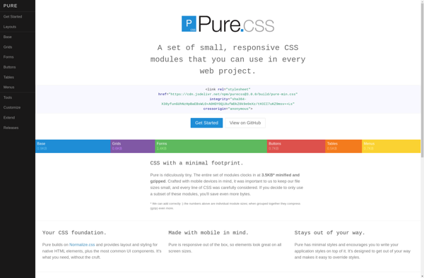
Purecss is an open-source CSS framework designed for quickly building lightweight, responsive web interfaces. Here are some key details about Purecss:Created and maintained by Yahoo/Verizon Media.Very lightweight at 4.5KB minified and gzipped.Follows a modular approach, allowing developers to include only the CSS for components they need.Provides layout modules like grids,...
Yourkube is an open-source low-code platform for building internal tools and workflows inside companies. It provides a visual editor and pre-built components that allow anyone inside a company to put together custom web apps, internal platforms, and workflows without needing to write any code.Some key features and benefits of Yourkube:Visual...
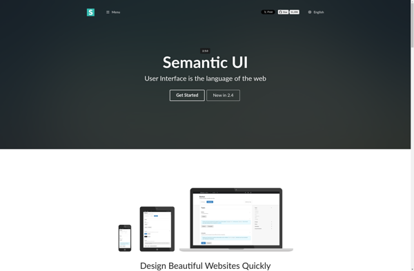
Semantic UI is an open-source front-end development framework that helps web developers build consistent, responsive web pages and web applications. It provides theming capabilities, templates, and reusable UI components to quickly build modern interfaces.Some key features of Semantic UI:Responsive grid system for building responsive layoutsprebuilt UI components like buttons, menus,...
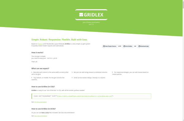
Gridlex is an open-source CSS grid framework for developing responsive, mobile-first website layouts and web applications. It is built on flexbox and provides an easy-to-use grid system for creating complex web layouts across multiple devices.Some key features of Gridlex include:Mobile-first and fully responsive - Columns and gutters adjust based on...
The Kube Web Framework is an open-source Python web framework that builds on top of Flask to make building complex, production-ready web applications easier and faster.Some key features and benefits of Kube include:Modular design - Kube has a very modular architecture that allows you to use only the components your...
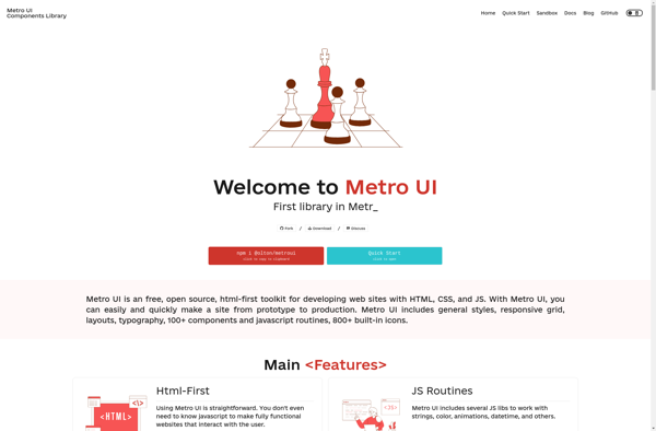
Metro UI CSS is an open source toolkit for developing web interfaces with a Windows 8 Metro style. It provides CSS and LESS stylesheets, typography, and JavaScript components to create tiled layouts, responsive designs, and flat user interface elements.Some key features of Metro UI CSS include:Tiles - Build tiled interfaces...
inuit.css is an open-source, Sass-based, OOCSS framework designed for large and long-lasting UI projects. It was created by Harry Roberts and first released in 2012.It provides a solid starting point for component/object-based UI development with basic typography settings, helper classes, Sass mixins, layout modules, and object class definitions. The goal...
Leaf is an open-source CSS framework for building responsive, mobile-first web sites and web applications. Developed by Animate.css co-creator Daniel Eden, Leaf aims to provide developers with the essential tools for crafting interfaces while avoiding unnecessary bloat.Some key features and capabilities of Leaf include:Flexible grid system based on Flexbox for...
Juiced is an open-source CSS framework built around Flexbox that makes it easy to create modern, responsive web layouts. Some key features and benefits of Juiced include:Lightweight and minimalistic - Under 15KB gzippedMobile-first and fully responsive designIncludes common UI components like buttons, cards, navbars, etc.Extensive Flexbox-powered grid system for building...
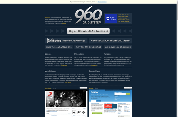
The 960 Grid System is a popular CSS framework used by web designers and developers to quickly create responsive website layouts. It provides a flexible grid system based on 12 or 16 columns, with preset CSS classes that make it easy to define column widths and positions within the layout.Some...
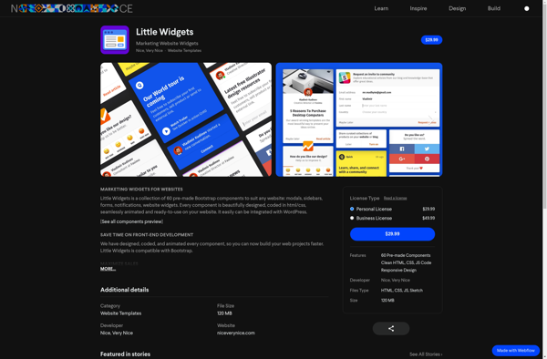
Little Widgets is a user-friendly widget creation and management application designed to provide an intuitive interface for designing, customizing, and deploying widgets across digital platforms. With its drag-and-drop widget builder, users can easily create engaging widgets in just minutes without needing to know how to code.The software comes packed with...
The Gumby Framework is an open-source, flexible front-end framework for developing responsive web projects. Built on top of Sass and Compass, Gumby uses a grid system based on percentages rather than pixels to enable responsive design across devices. It includes stylized UI elements like buttons, menus, and forms that are...
The Goldilocks Approach is an agile project management software designed to help teams work together effectively to build great products. It provides a complete platform with intuitive tools for planning projects, managing tasks and issues, facilitating collaboration, tracking progress, and gathering feedback.Key features include:Interactive boards for visualizing workflows and tracking...
Golden Grid System is a popular modular grid framework used by graphic designers and web developers to easily build layouts and websites. It provides a set of preset columns, gutters, margins, and templates to allow for the quick structure of responsive projects.Some key features of Golden Grid System include:Comes with...
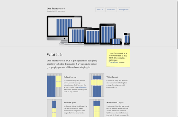
The Less Framework is an open-source CSS framework that makes it easy to build responsive web interfaces and apps. Here are some key things to know about Less Framework:Lightweight - Only 10KB minified and gzipped, with no JavaScript dependenciesResponsive - Supports natural responsive web design across devices and screen sizesCustomizable...
Amazium is an open-source, self-hosted website builder designed to allow anyone to create professional-looking websites without needing to know how to code. It features an easy-to-use drag-and-drop interface that makes building a site intuitive. Amazium also comes packed with dozens of modern, customizable templates that can be used as-is or...
Cascade Framework is an open-source Java web application framework designed to help developers build and organize complex websites and web applications. It provides a set of reusable components and tools that promote modularity, extensibility, and separation of concerns.Some key features of Cascade Framework include:A component-based architecture that allows developers to...
metro-bootstrap is an open-source front-end framework that builds on top of the popular Bootstrap library to provide additional UI/UX enhancements inspired by Microsoft's Metro design language. Some key highlights:Responsive and mobile-friendly - Built on Bootstrap, metro-bootstrap inherits responsive grid system and components that work on all devices.Metro-inspired UI - Includes...
Sassy-validation is an open source tool for validating Sass and SCSS stylesheets. It uses the SassScript syntax to define validation rules that check for common errors and enforce stylistic conventions.Some things that can be validated with Sassy-validation include:Variable definitions - Ensure variables are defined and used properlyMixin usage - Check...
Refills is a browser extension that automatically saves you money whenever you shop online. It works in the background to automatically find and apply coupon codes and cashback offers at checkout. Refills has access to extensive databases of valid coupons and promo codes for thousands of online stores.When you go...
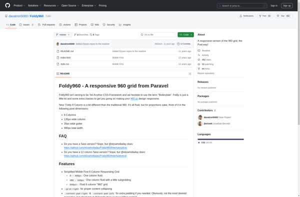
Foldy960 is an open-source software tool designed specifically for protein structure prediction and analysis. It incorporates sophisticated machine learning algorithms to predict the three-dimensional structure of protein molecules based solely on their amino acid sequence.Unlike many other protein structure prediction software, Foldy960 focuses specifically on predicting folding patterns and secondary...
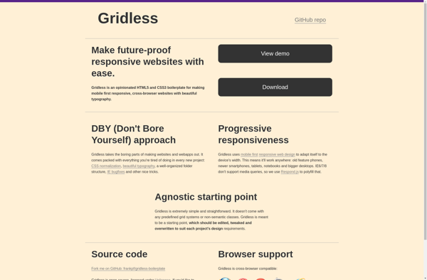
Gridless is an open-source website builder created by Anthropic that focuses on creative freedom in web design. Unlike most website builders that rely on templates and grid frameworks, Gridless allows you to place elements freely on the page without being constrained to a certain layout.Some key features and benefits of...
Responsable is a leading health and safety management software designed to help businesses track, manage and improve their safety programs. It provides a centralized cloud-based platform to standardize safety processes, reduce risk and increase productivity.Some key features of Responsable include:Incident reporting and investigations - Log incidents with rich data like...
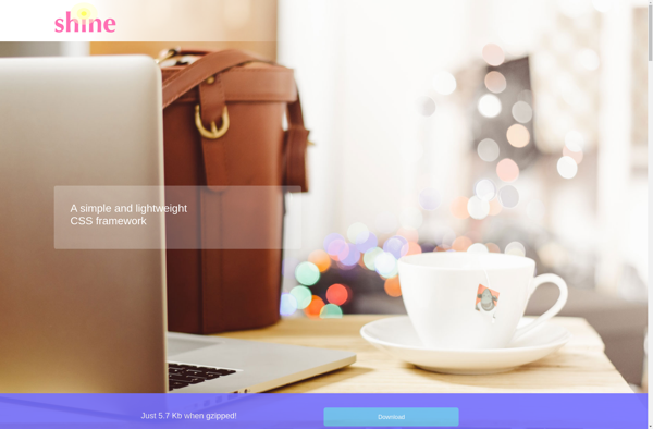
The Shine CSS Framework is an open-source cascading style sheet framework for designing responsive web pages and web applications. Developed by Muhammed Erdem, Shine provides basic styling constructs that can save developers time and avoid cross-browser compatibility issues.Some of the key features of Shine CSS Framework include:Lightweight design - Only...
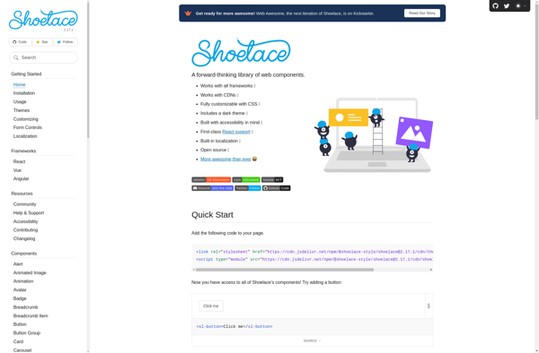
Shoelace.css is an open-source CSS framework designed to help developers quickly build modern, responsive web interfaces. It provides a collection of pre-designed CSS classes that can be used to style buttons, navigation menus, forms, grids, and more.Some key features of Shoelace.css include:Lightweight - Only ~35KB minified and gzippedCustomizable - Customize...
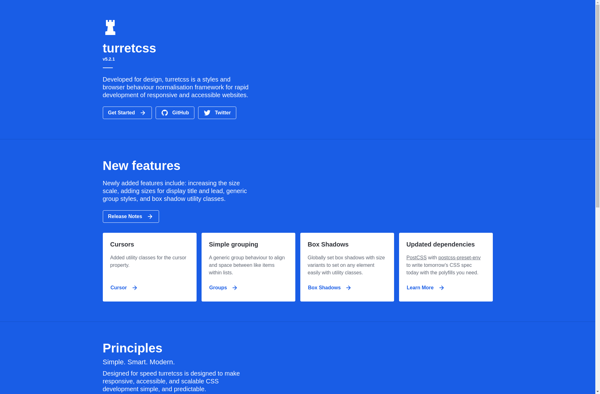
TurretCSS is an open-source CSS framework designed to help developers quickly build responsive, modern websites. It provides a collection of reusable CSS classes and components to style various interface elements of web pages and web applications.Some of the key features of TurretCSS include:Responsive grid system based on Flexbox to easily...
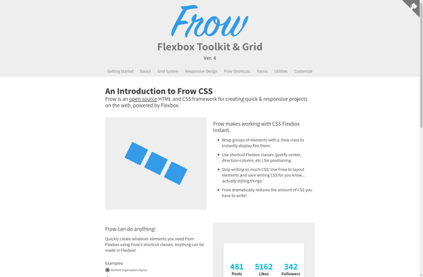
Frow is an open-source CSS grid framework that provides an alternative grid system to the more common column-based grids like Bootstrap or Foundation. It is built using Flexbox and focuses on row-oriented responsive layouts.While most grid frameworks use columns as their basis, Frow structures the layout using rows. This row-first...
The Variable Grid System is an open-source, flexible grid framework designed specifically for responsive web design. It gives developers an easy way to build adaptive, fluid layouts that look great on any device.Unlike other grid systems that rely on fixed column counts, VGS uses Sass variables to define the number...
Fluid Baseline Grid is a free open source WordPress plugin that makes it easy to implement a responsive baseline grid system for your WordPress site. It allows you to easily set up a fluid, proportional grid to use as the foundation for your website's layout and design.Some key features of...
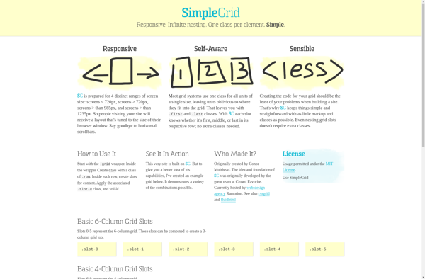
SimpleGrid is an open-source CSS framework designed specifically for building responsive grid layouts easily. Some key features of SimpleGrid include:Flexible grid system based on Flexbox that adjusts to any screen size automaticallyAbility to span columns for creative layoutsLightweight at only 3KB minified and gzippedSupports modern browsers including IE10+Built with Sass...
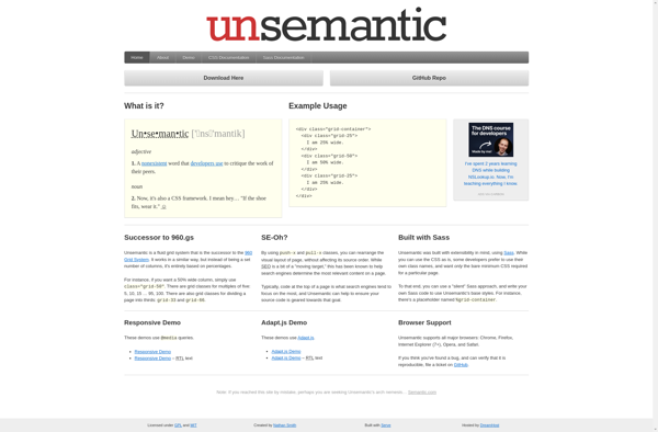
The Unsemantic CSS Framework is an open-source project that provides responsive grid layouts and common UI components without attaching any branding, styling or behavioral baggage. The goal is to provide layout and structure while getting out of the way and allowing web developers to focus on crafting semantically-meaningful markup.Some key...
Airframe is an open-source Python web framework designed for building scalable, high-performance web applications. Some key features and benefits of Airframe include:Lightweight and fast - Airframe uses an asynchronous, non-blocking architecture to handle requests efficiently and minimize overhead.Intuitive routing system - Easily map URLs to request handlers with a simple,...
320 and Up is a user-friendly website builder that enables people with no coding skills to create stunning, responsive websites. With an intuitive drag-and-drop interface, 320 and Up makes website creation simple and efficient.320 and Up offers dozens of professionally designed templates suited for different industries such as retail, restaurants,...
Crow is a lightweight CSS grid framework for building responsive, mobile-first websites and web apps. It is based on a 12-column grid system with flexible widths that adapt to various screen sizes and devices.Some key features of Crow include:Mobile-first and fully responsive - Sites built with Crow easily adapt from...
The Fluid 960 Grid System is an open source CSS framework that provides an easy way to create flexible, responsive website layouts. It is based on a 12-column grid with 20 pixel gutters between columns. The columns shrink and expand fluidly to adapt to different device sizes, ensuring the content...
Fluent Kit is an open-source user interface kit that allows developers to build cross-platform desktop applications with native look and feel. It is developed by Microsoft and designed based on Fluent Design System. Fluent Kit provides a collection of over 100 customizable UI controls and components that can be used...


