Frow (flex row) CSS Grid System
Frow: Responsive Row-Oriented CSS Grid System
An open-source CSS grid system based on Flexbox, Frow offers row-oriented layouts for responsiveness and consistency across devices.
What is Frow (flex row) CSS Grid System?
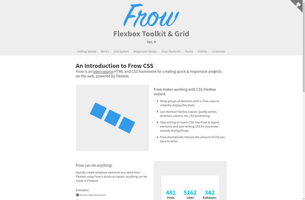
Frow is an open-source CSS grid framework that provides an alternative grid system to the more common column-based grids like Bootstrap or Foundation. It is built using Flexbox and focuses on row-oriented responsive layouts.
While most grid frameworks use columns as their basis, Frow structures the layout using rows. This row-first approach allows for more flexibility and consistency when designing for different devices and viewports. Frow has preset classes for defining the number of rows, setting row widths, distributing space between rows, and aligning row content.
Some key features and benefits of Frow include:
- Mobile-first and fully responsive row-based grid
- Easily build layouts row-by-row instead of column-by-column
- Consistent widths and positioning across device sizes
- Flexbox-powered, so works well across modern browsers
- Lightweight at around 3kb
- Open source and customizable Sass-based code
Frow is ideal for web designers and developers looking for a lightweight grid focused on responsive row layouts instead of columns. It can help streamline CSS and reduce complexity for responsive sites across devices.
Frow (flex row) CSS Grid System Features
Features
- Row-oriented layout using Flexbox
- Responsive design
- Consistent layout across devices
- Nestable grid
- Built-in utility classes
- SASS source files
Pricing
- Open Source
Pros
Cons
Official Links
Reviews & Ratings
Login to ReviewNo reviews yet
Be the first to share your experience with Frow (flex row) CSS Grid System!
Login to ReviewThe Best Frow (flex row) CSS Grid System Alternatives
View all Frow (flex row) CSS Grid System alternatives with detailed comparison →
Top Development and Css Frameworks and other similar apps like Frow (flex row) CSS Grid System
Here are some alternatives to Frow (flex row) CSS Grid System:
Suggest an alternative ❐
Tailwind CSS

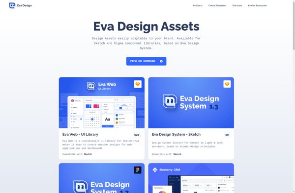
Eva Design System
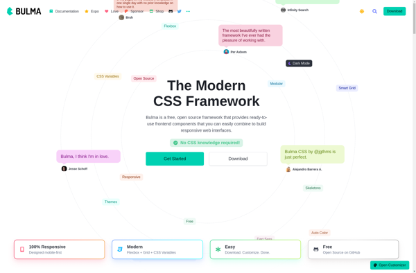
Bulma
UIkit

Tailwind UI

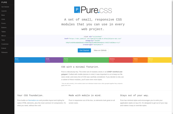
Purecss
Skeleton

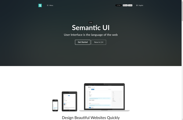
Semantic UI
React-md

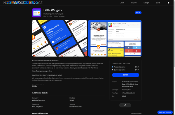
Little Widgets