Gridlex
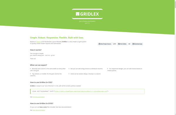
Gridlex: Open-Source CSS Grid Framework
Gridlex is an open-source CSS grid framework for web layouts. It provides a responsive, mobile-first flexbox grid system that makes it easy to build website layouts and web apps.
What is Gridlex?
Gridlex is an open-source CSS grid framework for developing responsive, mobile-first website layouts and web applications. It is built on flexbox and provides an easy-to-use grid system for creating complex web layouts across multiple devices.
Some key features of Gridlex include:
- Mobile-first and fully responsive - Columns and gutters adjust based on screen size
- Flexbox-based - Native support for flexbox layouts across modern browsers
- Lightweight - Under 20KB minified and gzipped
- Easy to customize - Change column counts, gutters, breakpoints, etc through Sass variables
- Cross-browser support - Works across modern browsers including IE10+
- Well documented - Detailed documentation with examples on layouts, usage, customization, etc.
Gridlex simplifies creating professional website and webapp designs by providing an intuitive grid system for arranging content. Developers can quickly prototype and iterate responsive layouts that work seamlessly across desktop, tablets, and mobile devices.
Gridlex Features
Features
- Responsive 12 column grid
- Mobile-first flexbox layout
- Nested grid system
- SASS source files
- Modular architecture
- Customizable with SASS variables
- Lightweight - only 3kb gzipped
Pricing
- Open Source
Pros
Cons
Official Links
Reviews & Ratings
Login to ReviewThe Best Gridlex Alternatives
View all Gridlex alternatives with detailed comparison →
Top Development and Web Development and other similar apps like Gridlex
Here are some alternatives to Gridlex:
Suggest an alternative ❐
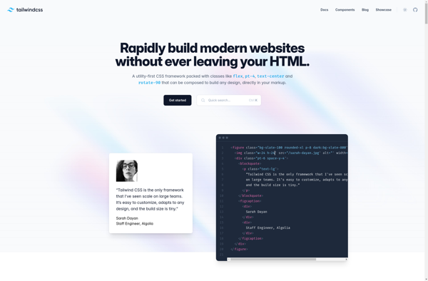
Tailwind CSS
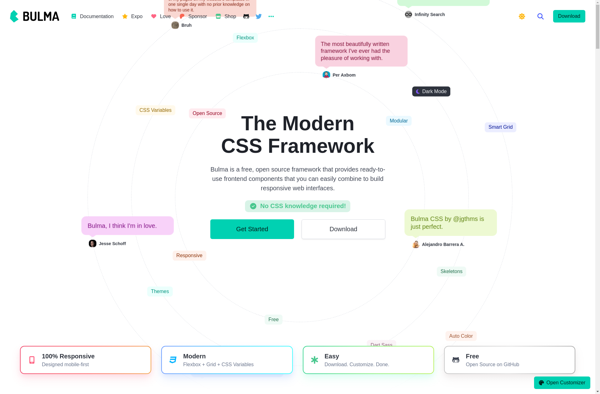
Bulma
UIkit

Tailwind UI
Purecss
Skeleton
Semantic UI
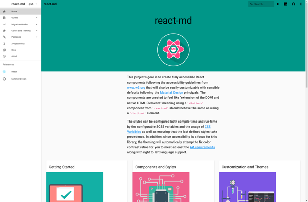
React-md
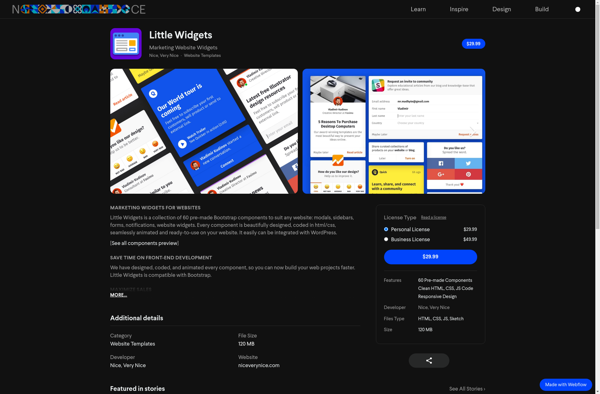
Little Widgets
Mini.css