Flexbox Grid
Flexbox Grid: Responsive CSS Grid Framework
An open-source CSS grid framework based on flexbox, providing a responsive grid system for easy layout and alignment creation across multiple screen sizes.
What is Flexbox Grid?
Flexbox Grid is an open-source CSS framework that provides a responsive grid system based on flexbox technology. It allows web developers to quickly create modern layouts and alignments for their web projects using familiar concepts like rows, columns, gutters, etc.
Some key features of Flexbox Grid:
- Fully responsive - The grid adapts seamlessly to any screen size from mobile to desktop.
- Lightweight and simple - Under 10KB gzipped size with easy class-based syntax.
- Cross-browser compatibility - Works well with the latest versions of modern browsers.
- Nesting and offsets - Allows nested grids and provides offset classes for alignment.
- SASS source files - Comes with SASS source for easy customization and theming.
Flexbox Grid simplifies front-end web development by providing an elegant grid system that leverages the power of flexbox. With its small footprint, ease-of-use and flexibility, Flexbox Grid is a great choice for building modern responsive web interfaces.
Flexbox Grid Features
Features
- Responsive grid system based on the flexbox model
- Supports multiple screen sizes
- Helps create layouts easily
- Uses CSS for alignments
- Open source and free to use
Pricing
- Open Source
- Free
Pros
Cons
Official Links
Reviews & Ratings
Login to ReviewThe Best Flexbox Grid Alternatives
View all Flexbox Grid alternatives with detailed comparison →
Top Development and Css Frameworks and other similar apps like Flexbox Grid
Here are some alternatives to Flexbox Grid:
Suggest an alternative ❐
Tailwind CSS
Bulma
UIkit

Tailwind UI

Purecss
Skeleton

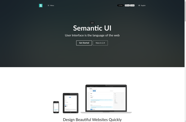
Semantic UI
React-md

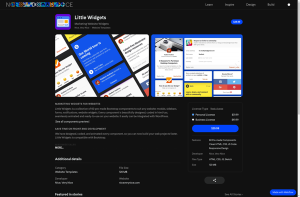
Little Widgets