960 Grid System
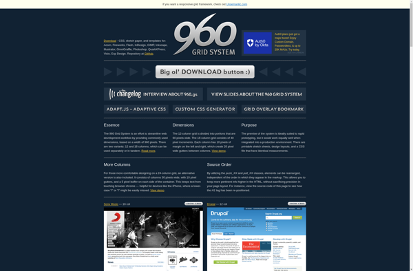
The 960 Grid System: Responsive CSS Framework
A flexible grid with 12 and 16 columns to build responsive websites quickly using CSS without writing all the CSS from scratch.
What is 960 Grid System?
The 960 Grid System is a popular CSS framework used by web designers and developers to quickly create responsive website layouts. It provides a flexible grid system based on 12 or 16 columns, with preset CSS classes that make it easy to define column widths and positions within the layout.
Some key features of the 960 Grid System:
- Comes with 12 and 16 column options for flexibility.
- Includes preset CSS classes like "grid_x" and "push_x" to control layout.
- Makes it easy to create responsive designs that adapt across device sizes.
- Lightweight and simple compared to more complex CSS frameworks.
- Good for rapid prototyping and basic website & app layouts.
- Well documented with usage examples and tutorials available.
- Open source and customizable by editing the base CSS files.
The 960 grid system helps web designers quickly mock up page layouts and provides an easy way to make layouts that adapt to various screen sizes. Instead of writing CSS float and width rules manually, the preset column formats handle a lot of that work. This allows designers to focus more on the overall design and content.
960 Grid System Features
Features
- 12 column responsive grid
- Predefined CSS classes for layout
- Support for mobile, tablet and desktop screens
- Easy to customize
- Lightweight code
Pricing
- Open Source
Pros
Cons
Official Links
Reviews & Ratings
Login to ReviewThe Best 960 Grid System Alternatives
View all 960 Grid System alternatives with detailed comparison →
Top Development and Web Development and other similar apps like 960 Grid System
Here are some alternatives to 960 Grid System:
Suggest an alternative ❐
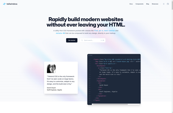
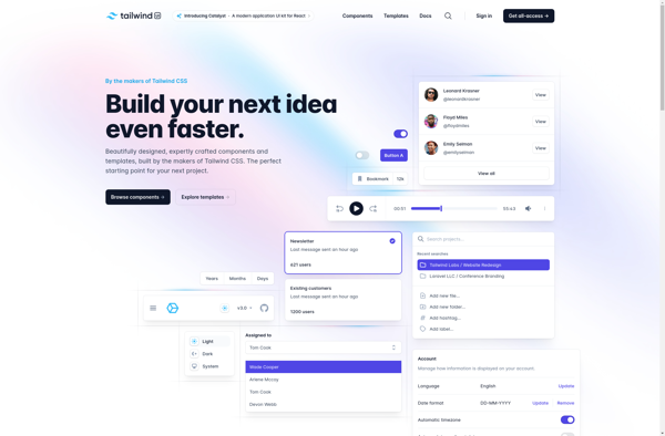
Tailwind CSS
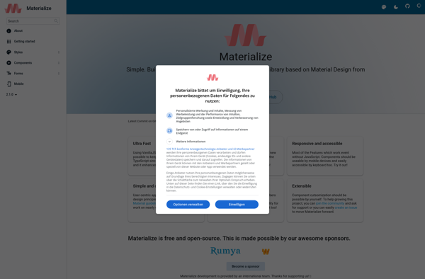
Materialize
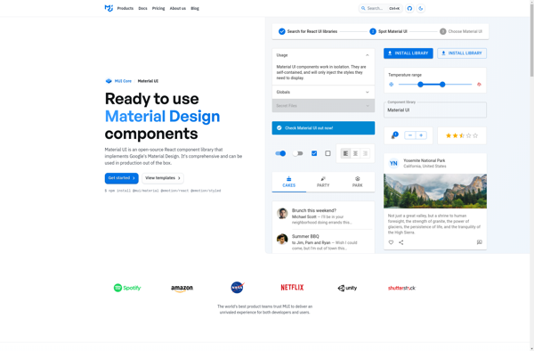
Material UI
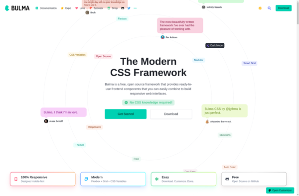
Bulma
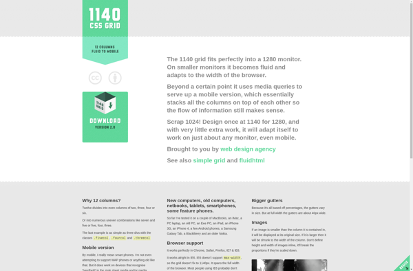
1140 CSS Grid
UIkit

Tailwind UI
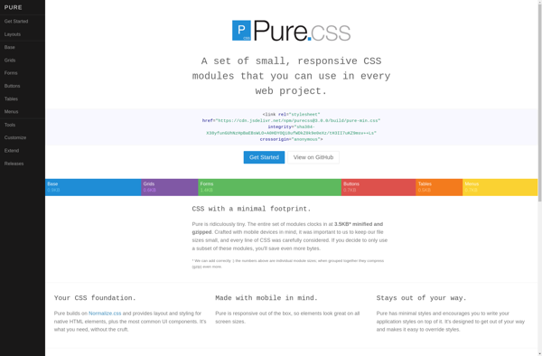
Purecss
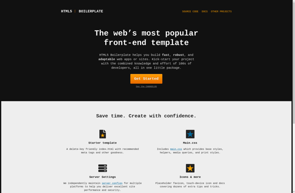
HTML5 Boilerplate
Skeleton
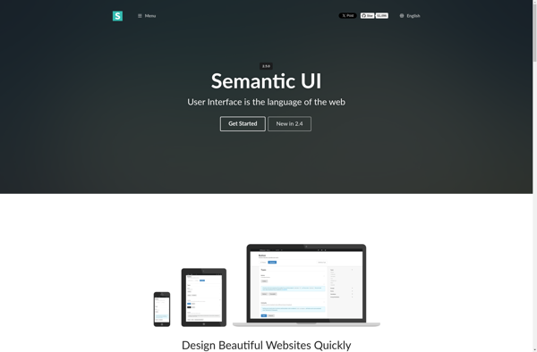
Semantic UI