HTML5 Boilerplate
HTML5 Boilerplate: Open Source Front-end Framework for Fast & Robust Web Apps
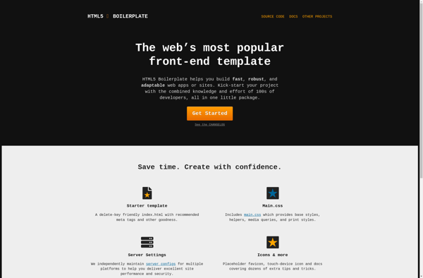
HTML5 Boilerplate is an open source front-end web development framework that helps developers quickly build fast, robust, and adaptable web apps or sites.
What is HTML5 Boilerplate?
HTML5 Boilerplate is an open source front-end web development framework launched in 2010 to help web developers quickly build fast, robust, and adaptable web apps or sites.
It provides a basic HTML structure with useful defaults and best practices baked in, such as:
- Normalize.css for cross-browser compatibility
- jQuery and Modernizr JavaScript libraries
- Placeholder CSS styling
- Helper code for responsive images, cross-domain Ajax, and more
- Documentation on how to extend and customize
The goal of HTML5 Boilerplate is to give developers a head start building modern sites and web apps by eliminating repetitive tasks and allowing them to focus on their project-specific code. It aims to be a starting point rather than a framework.
Overall, it helps front-end developers skip over common difficulties and spend more time on the unique, business-specific challenges related to their own sites and applications.
HTML5 Boilerplate Features
Features
- HTML5 ready
- Cross-browser compatibility
- Normalize CSS
- jQuery and Modernizr included
- Helper code and documentation
- Extendable structure
- Optimized performance
Pricing
- Open Source
Pros
Cons
Official Links
Reviews & Ratings
Login to ReviewThe Best HTML5 Boilerplate Alternatives
View all HTML5 Boilerplate alternatives with detailed comparison →
Top Development and Web Development and other similar apps like HTML5 Boilerplate
Here are some alternatives to HTML5 Boilerplate:
Suggest an alternative ❐
Materialize
MUI
Material Bread
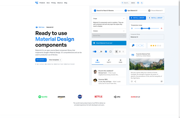
Material UI
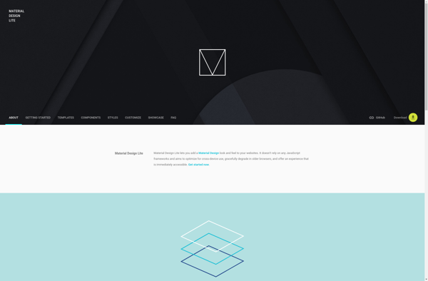
Material Design Lite
HTML KickStart
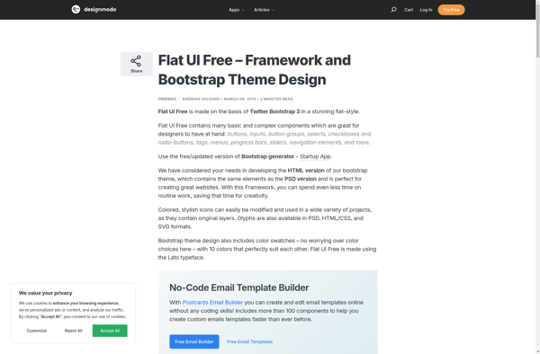
Flat UI Pro
960 Grid System
Cascade Framework
Sassy-validation
Foldy960
Variable Grid System
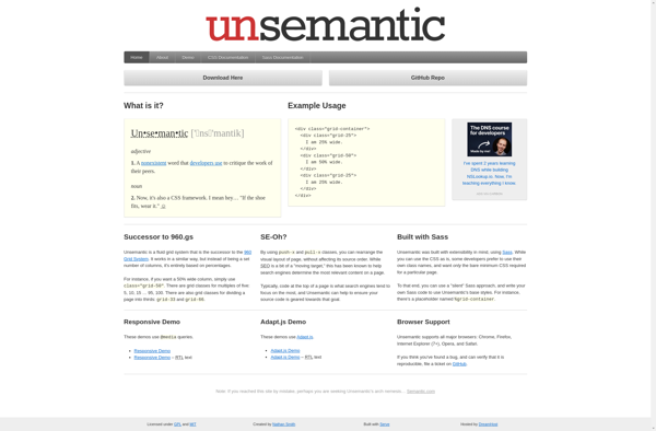
Unsemantic CSS Framework
Fluid 960 Grid System