Fluid 960 Grid System

Fluid 960 Grid System: Responsive CSS Framework
The Fluid 960 Grid System is a popular open source CSS framework for creating responsive, flexible website layouts based on a 12-column grid. It allows for rapid development of sites that adapt smoothly across devices.
What is Fluid 960 Grid System?
The Fluid 960 Grid System is an open source CSS framework that provides an easy way to create flexible, responsive website layouts. It is based on a 12-column grid with 20 pixel gutters between columns. The columns shrink and expand fluidly to adapt to different device sizes, ensuring the content fits neatly across various viewports.
Some key features of the Fluid 960 Grid System:
- Lightweight at only 2.25kB minified and gzipped
- Supports fluid layouts that adapt from mobile to widescreen monitors
- Includes preset CSS classes for quickly laying out sites
- Compatible with all modern browsers
- Easily customizable - change columns, gutters, etc
- Open source and free to use
The Fluid 960 Grid is a popular choice for web designers and developers looking to implement responsive designs quickly and easily. Its flexibility and small footprint make it ideal for use in all types of projects seeking an adaptive layout. It helps future-proof sites by making them look great regardless of the device.
Fluid 960 Grid System Features
Features
- 12 column responsive grid
- Predefined CSS classes for layouts
- Support for mobile, tablet, and desktop screens
- Built-in print styles
- Lightweight at only 3.5KB minified and gzipped
Pricing
- Open Source
Pros
Cons
Reviews & Ratings
Login to ReviewThe Best Fluid 960 Grid System Alternatives
View all Fluid 960 Grid System alternatives with detailed comparison →
Top Development and Web Development and other similar apps like Fluid 960 Grid System
Here are some alternatives to Fluid 960 Grid System:
Suggest an alternative ❐
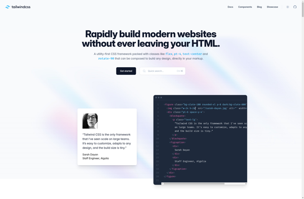
Tailwind CSS
Materialize
Material UI
UIkit

Tailwind UI
Purecss
HTML5 Boilerplate
Skeleton

Semantic UI
Topcoat