Salvattore

Salvattore: Responsive Multi-Column Grid Layout Library
An open-source JavaScript library for creating flexible and responsive grid layouts with multi-column arrangements, supporting dynamic resizing on window changes.
What is Salvattore?
Salvattore is an open-source JavaScript library developed by Rolando Murillo that enables responsive, multi-column grid layouts on web pages. It allows web developers to arrange elements like images, paragraphs, and divs into columns and grids that automatically adjust and rearrange based on the window or screen size.
One of the main benefits of Salvattore is that it provides an easy way to implement responsive multi-column grids without having to write complex CSS. The grids created with Salvattore will seamlessly transition between columns and stack vertically on small screens like phones. This saves development time and eliminates the need to manually write media queries.
To use Salvattore, the required HTML elements simply need to be placed inside a container element like a div, and Salvattore handles creating the column layout. Configuration options allow specifying parameters like the gap between columns. Events can also be bound to respond to grid adjustments. Salvattore has no other dependencies and works well with CSS frameworks and JavaScript libraries.
Overall, Salvattore is a lightweight JavaScript library that makes it simple to create responsive, fluid multi-column grid layouts that automatically adjust across screen sizes and devices. With an easy-to-use API, it's a useful tool for web developers looking to implement dynamic and flexible grid-based layouts.
Salvattore Features
Features
- Responsive grid layouts
- Dynamic column widths
- Media queries support
- Nested grid support
- Lightweight (~3kB)
Pricing
- Open Source
Pros
Cons
Official Links
Reviews & Ratings
Login to ReviewThe Best Salvattore Alternatives
View all Salvattore alternatives with detailed comparison →
Top Development and Web Development and other similar apps like Salvattore
Here are some alternatives to Salvattore:
Suggest an alternative ❐
Masonry

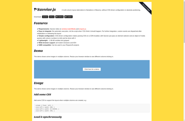
Savvior
Wookmark jQuery

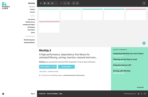
MixItUp