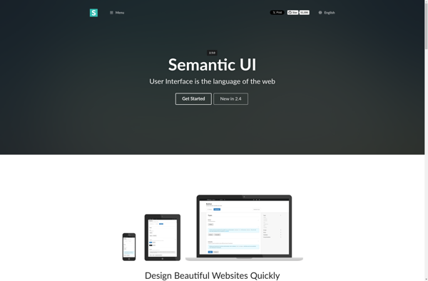
Semantic UI vs Variable Grid System

Struggling to choose between Semantic UI and Variable Grid System? Both products offer unique advantages, making it a tough decision.

Semantic UI is a Development solution with tags like responsive-design, themable, reusable-components, ui-framework.

It boasts features such as Responsive design, Theming capabilities, Reusable UI components, Templates, Consistent styling and pros including Open source, Good documentation, Active community support, Customizable and extensible, Works well with popular frameworks.

On the other hand, Variable Grid System is a Development product tagged with responsive-design, grid-system, sass, framework.

Its standout features include Responsive fluid grid system, Customizable with Sass variables, Adapts to any screen size, Flexible number of columns, Adjustable gutter widths, Nestable grid elements, Compatible with all major browsers, and it shines with pros like Easy to customize, Lightweight and fast, Good for rapid prototyping, Works well for responsive web design, Open source and free to use.

To help you make an informed decision, we've compiled a comprehensive comparison of these two products, delving into their features, pros, cons, pricing, and more. Get ready to explore the nuances that set them apart and determine which one is the perfect fit for your requirements.

Semantic UI

Semantic UI

Semantic UI is an open-source front-end development framework that helps web developers build consistent, responsive web pages and web applications. It provides theming capabilities, templates, and reusable UI components to quickly build modern interfaces.

Categories:
responsive-design themable reusable-components ui-framework

Semantic UI Features

  1. Responsive design
  2. Theming capabilities
  3. Reusable UI components
  4. Templates
  5. Consistent styling

Pricing

  • Open Source

Pros

Open source

Good documentation

Active community support

Customizable and extensible

Works well with popular frameworks

Cons

Steep learning curve

Not as lightweight as other UI libraries

Version 2.0 has breaking changes from v1.x

Less flexible compared to pure CSS solutions


Variable Grid System

Variable Grid System

Variable Grid System is an open-source, flexible grid framework for responsive web design. It allows developers to build fluid grid layouts that adapt to any screen size or device. The system uses Sass variables to customize column counts, gutter widths, and more.

Categories:
responsive-design grid-system sass framework

Variable Grid System Features

  1. Responsive fluid grid system
  2. Customizable with Sass variables
  3. Adapts to any screen size
  4. Flexible number of columns
  5. Adjustable gutter widths
  6. Nestable grid elements
  7. Compatible with all major browsers

Pricing

  • Open Source

Pros

Easy to customize

Lightweight and fast

Good for rapid prototyping

Works well for responsive web design

Open source and free to use

Cons

Less features than some grid frameworks

Requires Sass preprocessor

Not as robust for complex layouts

Less browser support than Bootstrap