Tableau vs GGobi

Struggling to choose between Tableau and GGobi? Both products offer unique advantages, making it a tough decision.

Tableau is a Business & Commerce solution with tags like data-visualization, business-intelligence, dashboards, data-analysis.

It boasts features such as Drag-and-drop interface for data visualization, Connects to a wide variety of data sources, Interactive dashboards with filtering and drilling down, Mapping and geographic data visualization, Collaboration features like commenting and sharing and pros including Intuitive and easy to learn, Great for ad-hoc analysis without coding, Powerful analytics and calculation engine, Beautiful and customizable visualizations, Can handle large datasets.

On the other hand, GGobi is a Data Visualization product tagged with data-visualization, exploratory-analysis, highdimensional-data, scatterplots, tours.

Its standout features include Interactive and dynamic graphics, Linked, coordinated views, Grand tours, Projection pursuit, Dimension reduction methods like PCA, Brushing and identification, Glyphs, and it shines with pros like Open source and free, Powerful and flexible visualization capabilities, Allows exploration of high-dimensional datasets, Linked, coordinated views make it easy to explore relationships, Support for large datasets.

To help you make an informed decision, we've compiled a comprehensive comparison of these two products, delving into their features, pros, cons, pricing, and more. Get ready to explore the nuances that set them apart and determine which one is the perfect fit for your requirements.

Tableau

Tableau

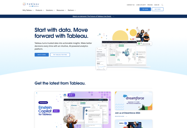
Tableau is a popular business intelligence and data visualization software. It allows users to connect to data, create interactive dashboards and reports, and share insights with others. Tableau makes it easy for anyone to work with data, without needing coding skills.

Categories:
data-visualization business-intelligence dashboards data-analysis

Tableau Features

  1. Drag-and-drop interface for data visualization
  2. Connects to a wide variety of data sources
  3. Interactive dashboards with filtering and drilling down
  4. Mapping and geographic data visualization
  5. Collaboration features like commenting and sharing

Pricing

  • Subscription-Based
  • Pay-As-You-Go

Pros

Intuitive and easy to learn

Great for ad-hoc analysis without coding

Powerful analytics and calculation engine

Beautiful and customizable visualizations

Can handle large datasets

Cons

Steep learning curve for advanced features

Limited customization compared to coding

Not ideal for statistical/predictive modeling

Can be expensive for large deployments

Limited mobile/offline functionality


GGobi

GGobi

GGobi is an open-source data visualization software used for interactive exploratory data analysis. It allows users to visualize high-dimensional datasets with scatterplots, parallel plots, tours, and dimension reduction methods like principal components analysis and grand tours.

Categories:
data-visualization exploratory-analysis highdimensional-data scatterplots tours

GGobi Features

  1. Interactive and dynamic graphics
  2. Linked, coordinated views
  3. Grand tours
  4. Projection pursuit
  5. Dimension reduction methods like PCA
  6. Brushing and identification
  7. Glyphs

Pricing

  • Open Source

Pros

Open source and free

Powerful and flexible visualization capabilities

Allows exploration of high-dimensional datasets

Linked, coordinated views make it easy to explore relationships

Support for large datasets

Cons

Steep learning curve

Limited documentation and support

Development seems to have stalled in recent years

Some stability issues

Lacks features of newer visualization tools