Wolf Responsive Designer
Wolf Responsive Designer: Website and Web Application Design Tool
Wolf Responsive Designer is a website and web application design tool that allows users to easily create responsive designs. It includes features like drag-and-drop editing, template libraries, collaboration tools, and automatic responsiveness.
What is Wolf Responsive Designer?
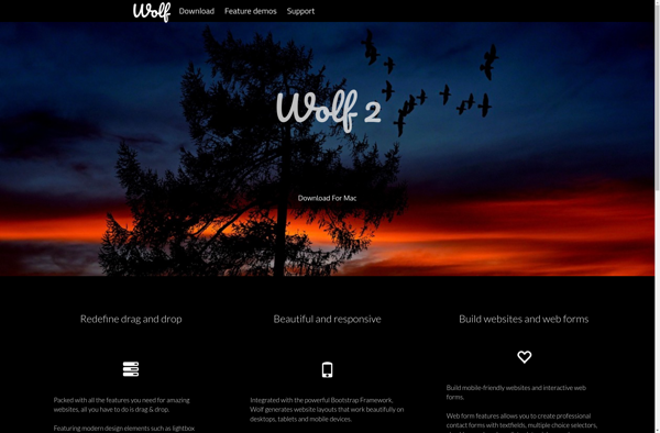
Wolf Responsive Designer is a powerful yet easy-to-use web design tool focused on creating responsive website and web app designs. With its intuitive drag-and-drop editor, you can quickly build professional designs optimized for any screen size.
Key features include:
- Drag-and-drop editing interface to easily arrange elements
- Huge library of site templates and UI components
- Collaboration tools to work with teams and clients in real-time
- Automatic responsiveness to adapt designs for mobile, tablet, and desktop
- Support for HTML, CSS, and JavaScript code customization
- Integrates with CMS platforms like WordPress and Shopify
- Publish and host sites directly from the app
Whether you're a seasoned web designer or just starting out, Wolf RWD makes it simple to mockup, prototype, and export production-ready responsive site designs that look fantastic on any device. Its intuitive workflow and powerful features have made it a top choice among web design professionals and small business owners alike.
Wolf Responsive Designer Features
Features
- Drag-and-drop website builder
- Responsive design templates
- Design collaboration tools
- Style customization options
- Built-in SEO tools
- Media library integration
- Cross-browser testing
Pricing
- Free
- Subscription-Based
Pros
Cons
Official Links
Reviews & Ratings
Login to ReviewThe Best Wolf Responsive Designer Alternatives
View all Wolf Responsive Designer alternatives with detailed comparison →
Top Development and Web Design and other similar apps like Wolf Responsive Designer
EverWeb
