Build Responsive

Build Responsive: Web Design Tool
Build Responsive is a web design tool that allows users to easily create responsive websites. It has a drag and drop interface to build sites, with pre-made sections, layouts, and components. Users can customize colors, fonts, animations and more. It generates clean, modern code and is good for quickly mocking up site ideas.
What is Build Responsive?
Build Responsive is a user-friendly web design tool created specifically for designing and building fully responsive websites. With its intuitive drag-and-drop interface, pre-designed sections, layouts, and components, Build Responsive makes it easy for anyone to create a professional-looking responsive site without needing to know code.
Some key features include:
- Drag-and-drop website builder with over 100 responsive pre-made section blocks
- 550+ font icon integrations
- Animation effects for images, text, buttons, etc.
- Detailed style customization options - colors, fonts, padding, margins, borders, shadows, and more
- Responsive breakpoints handling for desktop, tablet and mobile displays
- Mobile-first approach and touch-friendly interactions
- Clean, valid HTML5 and CSS3 code generated
Build Responsive is ideal formocking up website ideas quickly, building pages and prototypes, or creating full sites for personal portfolios, small businesses, online stores, and more without needing to code. With its flexibility and customizations, you can create unique designs while still having structured sections that ensure a responsive site. And with seamless publishing built-in, you can launch your website with one click.
Build Responsive Features
Features
- Drag and drop interface
- Pre-made sections, layouts and components
- Customizable colors, fonts, animations
- Generates clean, modern code
- Good for quickly mocking up site ideas
Pricing
- Freemium
- Subscription-Based
Pros
Cons
Official Links
Reviews & Ratings
Login to ReviewThe Best Build Responsive Alternatives
View all Build Responsive alternatives with detailed comparison →
Top Development and Website Builders and other similar apps like Build Responsive
Here are some alternatives to Build Responsive:
Suggest an alternative ❐
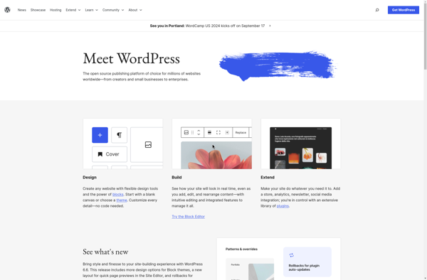
WordPress
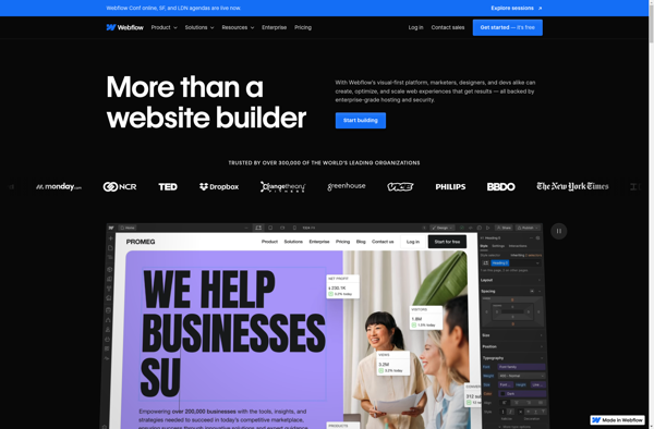
Webflow
Wix.com

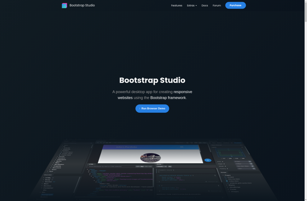
Bootstrap Studio
Squarespace

Google Sites

Weebly

Directus

Jimdo

DEV Community
