Flexbox Patterns
Flexbox Patterns: Free Web App
Generate CSS code for various flexbox layouts and patterns with Flexbox Patterns, a free web app that allows visual design by dragging and arranging boxes.
What is Flexbox Patterns?
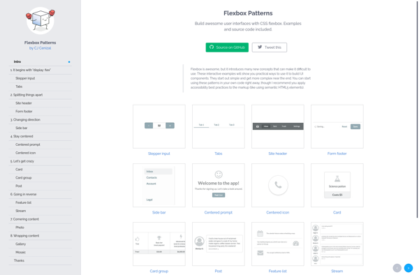
Flexbox Patterns is a free web application that allows you to visually design flexible layouts using CSS flexbox. It provides a drag-and-drop interface where you can arrange box elements representing different parts of your web page layout.
As you arrange the boxes, Flexbox Patterns automatically generates the corresponding CSS flexbox code. So you can experiment with different layouts and patterns very easily without needing to manually write CSS. It helps conceptualize and prototype flexbox layouts much faster.
Flexbox Patterns has a variety of ready-made responsive layout patterns to choose from such as hero sections, cards, navigation bars, media objects, and more. You can customize the number of columns, change box sizes, adjust spacing, and more options to create your desired layout.
The app then provides clean, readable CSS code that you can simply copy-paste into your own project to implement the flexbox layout. It works well for rapid prototyping of responsive site layouts as you can iterate quickly without coding.
As flexbox has good browser support now, the CSS generated by Flexbox Patterns should reliably create cross-browser responsive layouts. With its visual editor and large selection of premade patterns, Flexbox Patterns is a helpful tool for web designers and developers working with flexbox.
Flexbox Patterns Features
Features
- Visual interface to create flexbox layouts
- Drag and drop boxes to design page layout
- Generate CSS code for flexbox patterns
- Library of common flexbox layouts and templates
- Responsive design support
- Copy CSS code snippets
Pricing
- Free
Pros
Cons
Official Links
Reviews & Ratings
Login to ReviewThe Best Flexbox Patterns Alternatives
View all Flexbox Patterns alternatives with detailed comparison →
Top Development and Web Development and other similar apps like Flexbox Patterns
Here are some alternatives to Flexbox Patterns:
Suggest an alternative ❐
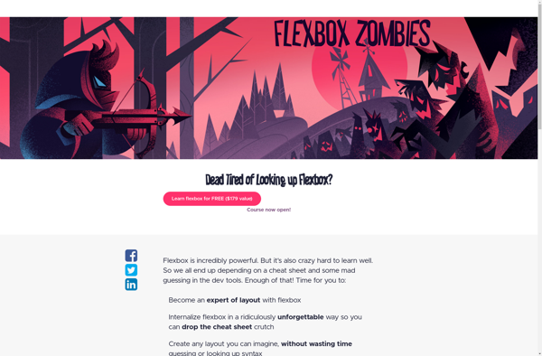
Flexbox Zombies
Solved by Flexbox

Awesome Flexbox