Optimal Layout
Optimal Layout: Web Design Tool for Responsive Website Layouts
Discover the easy-to-use web design tool that helps you create responsive website layouts with a drag-and-drop interface and premade styles, revolutionizing your online presence.
What is Optimal Layout?
Optimal Layout is a user-friendly web design tool focused on creating responsive website layouts. It features an intuitive drag-and-drop interface that allows users to arrange predefined content blocks representing common website elements like headers, text sections, images, etc. Users can then customize the appearance of these blocks using the style editor which offers a variety of premade design templates and styles.
A key capability of Optimal Layout is its intelligent auto-responsive feature. As users create their layout, the software automatically adapts it for viewing on different device sizes like desktops, tablets and mobile phones. This saves designers significant time compared to manually building responsive capabilities. Users can toggle between device views to optimize their layouts as needed.
The platform also integrates with popular web building and hosting solutions like Wix and WordPress to streamline publishing completed layouts. Users can export their responsive layouts with one click integration. The software is very beginner-friendly with its easy learning curve while still providing advanced customization options for more experienced designers. It's an excellent responsive web design tool for businesses, agencies and individuals looking to quickly build multi-device website layouts.
Optimal Layout Features
Features
- Drag-and-drop interface for arranging content blocks
- Premade styles for adjusting the appearance of content blocks
- Responsive design capabilities for creating mobile-friendly layouts
- Real-time preview of layout changes
- Export options for HTML/CSS code
Pricing
- Freemium
- Subscription-Based
Pros
Cons
Reviews & Ratings
Login to ReviewThe Best Optimal Layout Alternatives
View all Optimal Layout alternatives with detailed comparison →
Top Web Browsers and Web Design and other similar apps like Optimal Layout
Here are some alternatives to Optimal Layout:
Suggest an alternative ❐
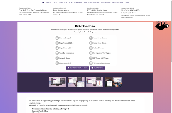
BetterTouchTool
AquaSnap

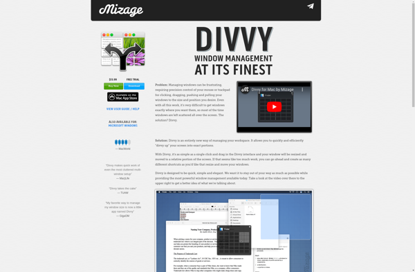
Divvy
SmartSystemMenu
WindowGrid
Shiftit
Altdrag
Preme for Windows

Yabai
Actual Window Manager