Atlas charts is an alternative data visualization software to Tableau with interactive JS charts and dashboards. Allows fast visual analysis at a lower cost and with full customization options.
Alternative to Tableau with fast visual analysis, interactive JS charts, and customizable dashboards at a lower cost.
What is Atlas charts?
Atlas charts is a data visualization and business intelligence software that provides an alternative to Tableau. It allows users to create interactive JavaScript charts, dashboards, and reports for data analysis and visualizations. Some key features of Atlas charts include:
Drag and drop interface to build charts and dashboards quickly without coding
Support for JSON, CSV, Excel, Google Sheets etc as data sources
Over 30 customizable chart types including bar, line, area, pie, pivot tables etc
Filtering, grouping, sorting options to slice and dice data on the fly
Scheduled email reports and embedding options
Team collaboration features with access controls and sharing
Works across devices - mobile, tablet and desktop browsers
Lower pricing compared to Tableau
Atlas charts provides a code-free way for businesses to understand data patterns and turn numbers into interactive insights. The visual editor makes it easy for anyone to build reports and dashboards in a self-service model. Compared to Tableau, Atlas charts offers more flexibility and features at a fraction of the cost and complexity. Its lightweight UI and JS charts can scale across the organization for faster decisions.
Atlas charts Features
Features
Interactive JavaScript charts and dashboards
Drag-and-drop interface for building visualizations
Connect to various data sources like SQL, MongoDB, REST APIs
Google Charts is a robust and flexible JavaScript charting and data visualization library provided for free by Google. It offers developers a highly customizable way to create interactive charts, graphs, and data tables that seamlessly integrate into web pages and applications.With Google Charts, you can visualize complex data sets and...
Plotly is an open-source graphing library that allows users to create interactive, publication-quality graphs, charts, and dashboards. It supports Python, R, JavaScript, and Excel as programming languages. Some key features of Plotly include:Interactive visualization - Plotly charts are interactive with features like hover text, zooming, panning, selectable legends, and editable...
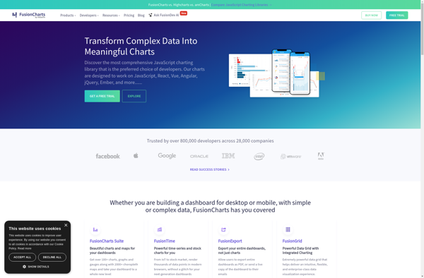
FusionCharts Suite XT is a comprehensive JavaScript charting solution that offers over 90 chart types including column, bar, pie, line, area, scatter, bubble charts and more. It also includes over 1100 maps including choropleth, markers, routes and more.Some key features of FusionCharts Suite XT:Interactive JavaScript charts, gauges and maps for...
KoolChart is charting and data visualization software designed to enable users of all skill levels to easily create a wide variety of charts, graphs, and dashboards to display complex data. With its intuitive drag-and-drop interface, integrated analytics, and library of templates, KoolChart aims to make data visualization accessible for everyone.Some...
ChartBlocks is a business intelligence and data visualization software used to create interactive charts, dashboards, and reports for better data analysis. It provides an easy drag-and-drop interface to build visualizations quickly without the need for coding.Some key features of ChartBlocks include:Drag-and-drop functionality to create various charts like bar, line, pie,...
ZoomCharts is a feature-rich JavaScript charting library used to create interactive data visualizations for web applications and dashboards. With over 90 chart types to choose from, including line, bar, pie, map, scatter, and more, ZoomCharts provides the flexibility to represent data in a meaningful way.Some of the key capabilities and...
ChartURL is an open-source data visualization and charting software used to create interactive visualizations from data. It can connect to various data sources like SQL databases, CSV files, REST APIs and more to import data and auto-generate charts and dashboards. Key features include:Intuitive drag-and-drop interface to build dashboardsSupport for multiple...
Statpedia is a comprehensive online resource for statistics and probability concepts. It features a searchable glossary with over 1,000 clear and concise definitions for statistical terminology along with relevant examples. Topics covered range from the basics of statistics like mean, median, mode, and standard deviation all the way to more...
Chartico is a cloud-based data visualization and business intelligence software that allows users to easily create interactive charts, dashboards and reports from their data. Some key features of Chartico include:Drag-and-drop interface to build charts, dashboards and reports visually without codingConnect to data from SQL, MongoDB, Excel, CSVs and other sources...