ChartURL is an open-source alternative to data visualization and charting software like Tableau. It allows users to create interactive charts, dashboards and reports from various data sources.
ChartURL is an open-source alternative to data visualization and charting software like Tableau. It allows users to create interactive charts, dashboards and reports from various data sources.
What is ChartURL?
ChartURL is an open-source data visualization and charting software used to create interactive visualizations from data. It can connect to various data sources like SQL databases, CSV files, REST APIs and more to import data and auto-generate charts and dashboards. Key features include:
Intuitive drag-and-drop interface to build dashboards
Support for multiple chart types like bar, pie, line, scatter plots etc.
Interactive features like filtering, drilling down and tooltips
Sharing and embedding dashboards through simple URLs
Scheduled report generation and delivery
Access control and user management capabilities
Custom branding and white-labeling options
Completely open-source and available for self-hosting
With its user-friendly interface and flexibility, ChartURL is a great open-source alternative to commercial tools like Tableau, Looker, Microsoft Power BI etc. It enables easy data exploration and visualization without needing extensive technical expertise.
ChartURL Features
Features
Create interactive charts and dashboards
Connect to various data sources (CSV, SQL, Excel, etc.)
Customizable chart types and visualizations
Collaborate and share charts with others
Responsive design for mobile and desktop
Embeddable charts and reports
Pricing
Open Source
Pros
Open-source and free to use
Wide range of chart types and customization options
Easy to integrate with different data sources
Collaborative features for sharing and teamwork
Responsive and mobile-friendly
Cons
May have a steeper learning curve compared to commercial alternatives
Limited support and community compared to larger commercial products
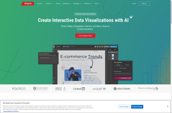
Infogr.am is a user-friendly infographic and data visualization creation software. With an easy drag-and-drop interface, it enables anyone to create sleek, interactive infographics, charts, maps and dashboards in just minutes without coding.Some key features of Infogr.am:Large library of charts and graphs (bar, pie, line, area, scatterplots etc.) to visualize dataInteractive...
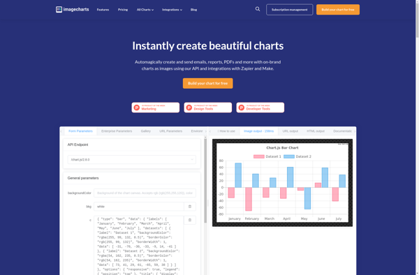
Image Charts is a powerful yet easy-to-use charting API for developers. It allows you to generate a wide variety of interactive charts and data visualizations simply by making API calls. Some key features of Image Charts:Supports over 20 highly customizable chart types including line, bar, pie, donut, area, heatmap and...
Teradata is a leading enterprise data warehousing solution designed for large-scale data storage, management, and analysis. It leverages parallel processing and advanced database design to enable high-performance analytics on petabyte-scale data volumes.Some key capabilities and benefits of Teradata include:Massive scalability and storage capacity for storing hundreds of terabytes to petabytes...
Atlas charts is a data visualization and business intelligence software that provides an alternative to Tableau. It allows users to create interactive JavaScript charts, dashboards, and reports for data analysis and visualizations. Some key features of Atlas charts include:Drag and drop interface to build charts and dashboards quickly without codingSupport...
Statpedia is a comprehensive online resource for statistics and probability concepts. It features a searchable glossary with over 1,000 clear and concise definitions for statistical terminology along with relevant examples. Topics covered range from the basics of statistics like mean, median, mode, and standard deviation all the way to more...
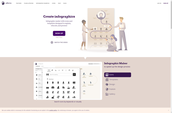
Adioma is a cloud-based translation management system designed to help companies manage multilingual content and translation workflows. Some key features of Adioma include:Translation Memory - Stores previously translated content to promote re-use and consistency across translations.Machine Translation Integration - Integrates with machine translation engines like Google Translate for automated translations.Workflow...
Chartico is a cloud-based data visualization and business intelligence software that allows users to easily create interactive charts, dashboards and reports from their data. Some key features of Chartico include:Drag-and-drop interface to build charts, dashboards and reports visually without codingConnect to data from SQL, MongoDB, Excel, CSVs and other sources...
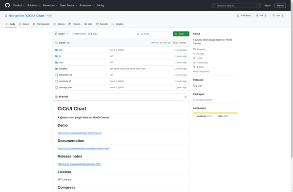
CiCiUI Chart is a feature-rich JavaScript charting library built on HTML5 Canvas element. It allows developers to easily create highly customizable, interactive charts and graphs and embed them into web pages and applications.Some key features and capabilities of CiCiUI Chart include:Supports a wide variety of chart types out of the...
Progress OpenEdge is a development platform optimized for creating business applications. It includes a 4th generation programming language (4GL) designed for rapid application development along with tools for building user interfaces, reporting, integration, and application management.Key features of Progress OpenEdge include:4GL language for faster coding and reduced maintenance costs compared...