Plotly
Plotly is an open-source graphing library for Python, R, JavaScript, and Excel. It allows users to create interactive, publication-quality graphs, charts, and dashboards that can be embedded in websites and apps. Plotly is useful for data analysis and visualization.

Plotly: Open-Source Graphing Library for Data Analysis & Visualization
Plotly is an open-source graphing library for Python, R, JavaScript, and Excel, allowing users to create interactive, publication-quality graphs, charts, and dashboards that can be embedded in websites and apps.
What is Plotly?
Plotly is an open-source graphing library that allows users to create interactive, publication-quality graphs, charts, and dashboards. It supports Python, R, JavaScript, and Excel as programming languages. Some key features of Plotly include:
- Interactive visualization - Plotly charts are interactive with features like hover text, zooming, panning, selectable legends, and editable titles.
- Range of chart types - Users can create line charts, bar charts, scatter plots, bubble charts, pie charts, heatmap charts, contour charts, dendrogram charts, 3D charts and more.
- Dashboards - Multiple Plotly charts can be arranged into dashboards with slider and drop down controls for dynamic filtering and cross highlighting.
- Statistical charts - Plotly can create statistical visualizations like box plots, violin plots, histogram charts, probability density functions and more.
- Maps - Geographic map charts and heatmaps can be created with Plotly Express and Plotly Graph Objects.
- Animation - Charts can be animated to show changes over time or transitions between data states.
- Sharing and embedding - Charts can be shared online or embedded in websites and apps with a few lines of code.
- Connectivity - Plotly can connect to external data sources like CSV and Excel files or databases and data APIs.
- Theming and styling - Extensive custom theming options are available to match company or brand styles.
- Open source - Plotly is open source and free for personal and commercial use.
Overall, Plotly is a versatile data visualization library suitable for interactive data analysis workflows and dashboard creation across a variety of programming languages and platforms.
Plotly Features
Features
- Interactive data visualization
- Support for Python, R, JavaScript, Excel
- 2D and 3D plotting
- Statistical charts
- Dashboards
- Collaboration tools
- Exporting and sharing
Pricing
- Freemium
- Subscription-based
Pros
User-friendly
High-quality visualizations
Cross-platform compatibility
Open source and free
Large gallery of examples
Active community support
Cons
Steep learning curve
Limited customization compared to matplotlib
Online dependency for full functionality
Freemium pricing model limits features
Official Links
Reviews & Ratings
Login to ReviewThe Best Plotly Alternatives
View all Plotly alternatives with detailed comparison →
Top Data Visualization and Interactive Charting and other similar apps like Plotly
Here are some alternatives to Plotly:
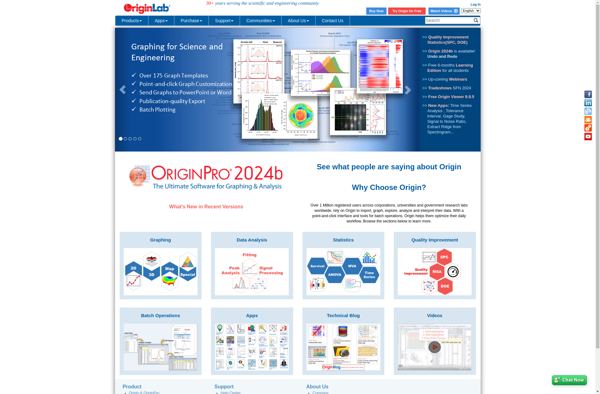
Suggest an alternative ❐OriginPro
OriginPro is a powerful data analysis and graphing software designed for scientists, engineers, and analysts across various industries. It is developed by OriginLab Corporation for analyzing, graphing, and presenting scientific data.Some of the key features of OriginPro include:An extensive selection of analysis tools like peak analysis, surface fitting, statistics, signal...
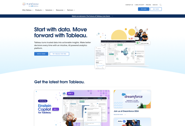
Tableau
Tableau is a leading business intelligence and data visualization platform used by organizations of all sizes to transform their data into easy-to-understand visualizations and dashboards. With Tableau, users can connect to a wide range of data sources, prepare and clean the data for analysis, and create interactive data visualizations such...
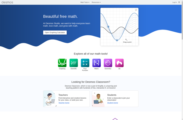
Desmos
Desmos is an online graphing calculator and geometry tool used by students, teachers, and professionals in math, science, engineering, business, and more. It allows users to quickly visualize mathematical functions, equations, inequalities, and data sets with an easy-to-use web interface and mobile apps for iOS and Android.Key features of Desmos...
Google Charts
Google Charts is a robust and flexible JavaScript charting and data visualization library provided for free by Google. It offers developers a highly customizable way to create interactive charts, graphs, and data tables that seamlessly integrate into web pages and applications.With Google Charts, you can visualize complex data sets and...

Highcharts
Highcharts is an advanced JavaScript charting library used to visualize data and create interactive charts and graphs in web applications. Originally developed in 2009 by Highsoft AS, Highcharts allows developers to quickly add charts and graphs to their web pages with support for a wide variety of chart types out...

Datamatic.io
Datamatic.io is a cloud-based no-code data pipeline platform that allows users to build data integration, transformation, and loading processes without needing to write any code. Some key features of Datamatic.io include:Graphical interface to visually design data pipelines by connecting various pre-built data source and destination connectors as well as transformation...

Visuafy
Visuafy is a powerful yet user-friendly data visualization and dashboarding platform used by companies and organizations to gain meaningful insights from their data. It allows users without coding skills to create customized, interactive data visualizations including charts, graphs, gauges, maps, and more.Key features of Visuafy include:Drag-and-drop interface to easily build...
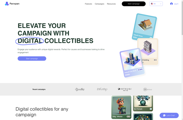
Panxpan
Panxpan is a free and open source spreadsheet application that offers functionality and features comparable to Microsoft Excel. It allows users to create spreadsheets, organize and analyze data, create charts and graphs, perform calculations using formulae and functions, and collaborate with others.Some key features of Panxpan include:Import and export to...
ChartBlocks
ChartBlocks is a business intelligence and data visualization software used to create interactive charts, dashboards, and reports for better data analysis. It provides an easy drag-and-drop interface to build visualizations quickly without the need for coding.Some key features of ChartBlocks include:Drag-and-drop functionality to create various charts like bar, line, pie,...

AmCharts
amCharts is a feature-rich JavaScript charting library that enables you to create interactive charts, dashboards, and data visualizations. With amCharts, you can build solutions for both web and mobile platforms.Some key capabilities and benefits of amCharts include:Supports a wide variety of chart types: line, column, bar, pie, radar, scatter, gauges,...

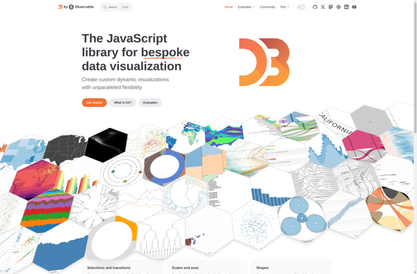
D3.js
D3.js, or D3, is an open-source JavaScript library used for visualizing data with web standards. D3 stands for Data-Driven Documents. It allows developers to bind arbitrary data to the Document Object Model (DOM) and then apply data-driven transformations to the document. This allows web developers to create dynamic, interactive data...
C3.js
C3.js is an open-source JavaScript library for generating clear and attractive charts. It is a wrapper built on top of D3.js that simplifies common chart types like line, bar, pie, scatter, stacked graphs, etc. The goal is to provide an easy way for web developers to visualize data without writing...

Open Flash Chart
Open Flash Chart is an open-source JavaScript charting library used to create interactive Flash-based charts for web applications. It provides an easy way for developers to add advanced data visualizations and graphs to their websites without needing to write Flash code.Some key features of Open Flash Chart include:Support for various...

DIVE by MIT Media Lab
DIVE (Data Insight Visualization Explorer) is an open source web application developed by researchers at the MIT Media Lab. It is designed to enable interactive exploration and visualization of complex, multi-faceted datasets.Some key features of DIVE include:Intuitive drag-and-drop interface for rapidly building visualizations like maps, charts, graphs, and moreSupport for...
AnswerMiner
AnswerMiner is an artificial intelligence-powered software that helps companies improve their customer support operations and experiences. It analyzes large volumes of customer service conversation data, including emails, chat transcripts, and call center notes, to provide actionable insights.The key features and benefits of AnswerMiner include:Understanding Frequent Customer Questions and Pain Points:...

NVD3
NVD3 is an open-source JavaScript charting library used to build interactive data visualizations in web browsers. It is based on D3.js and reuses parts of the D3 codebase to create reusable charts. NVD3 aims to simplify and streamline D3 code for faster web development.Some key features of NVD3 include:Over a...

LightCat
LightCat is an emerging open-source password manager that allows users to securely store website logins, credit card numbers, identities, and other sensitive information behind one master password. It utilizes strong AES-256 bit encryption to protect user data and ensures information is accessible only to the owner.Some key features of LightCat...
Dc.js
dc.js is a JavaScript charting library that leverages d3.js and crossfilter for interactive dimensional charting and visual analysis of large datasets. Some key features of dc.js include:Integration with d3.js for powerful and flexible visualizationsTight integration with crossfilter for fast filtering and grouping of large datasetsFocus+Context and Brushing chart interactionsAnimated transitions...

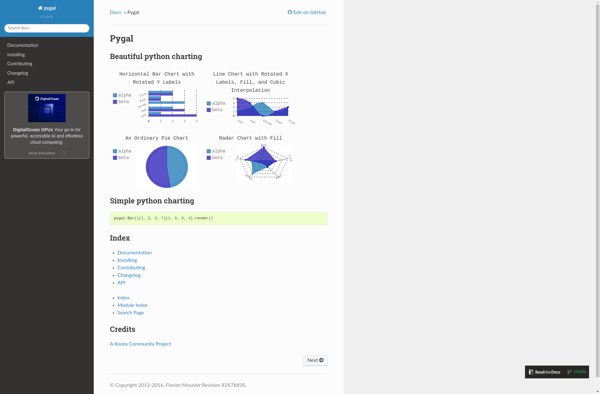
Pygal
Pygal is an open-source Python charting library that provides tools to build interactive SVG charts and graphs from data. Some of the key features and capabilities of Pygal include:Support for various common chart types including bar charts, pie charts, line charts, xy charts, radar charts, box plots, dot plots etc.Highly...
Bokeh
Bokeh is an open-source Python library for creating interactive data visualizations for modern web browsers. It allows users to quickly construct versatile and high-performance graphics from simple plots to complex dashboards. Some key features of Bokeh include:Integration with common Python data science libraries like NumPy, Pandas, Scikit-Learn for easy data...

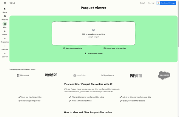
Parquet Data Viewer
Parquet Data Viewer is an open-source, cross-platform application for visually analyzing and exploring Parquet data files. Developed by Atlan, it provides an intuitive graphical interface to examine the contents of Parquet files without needing to write code.With Parquet Data Viewer, you can quickly:See the data types, compression types, row group...
ZoomCharts
ZoomCharts is a feature-rich JavaScript charting library used to create interactive data visualizations for web applications and dashboards. With over 90 chart types to choose from, including line, bar, pie, map, scatter, and more, ZoomCharts provides the flexibility to represent data in a meaningful way.Some of the key capabilities and...

Picasso.js
Picasso.js is an open-source JavaScript charting library built on top of the HTML5 Canvas element. It provides a simple yet powerful API for easily creating rich and interactive data visualizations and charts in the browser.Some of the key features of Picasso.js include:Supports a wide variety of chart types out of...

Vis.js
Vis.js is an open source data visualization library built with JavaScript. It allows developers to create interactive visualizations such as timelines, networks and graphs easily in the browser using web standards.Some of the key features of Vis.js include:Various data visualization modules for timelines, networks, graphs etc.Easily customizable and extensible to...

Charts 4 PHP
Charts 4 PHP is an open-source and free PHP charting library that allows developers to create interactive charts, graphs and data visualizations using PHP. It provides an easy way to visualize data on web applications and sites built with PHP.Some key features of Charts 4 PHP:Supports various chart types including...

LiveGap Charts
liveGap Charts is an open-source JavaScript charting library used to build customizable, interactive data visualizations for the web. Developed by liveGap's engineering team, it was designed to provide an intuitive way to visualize data and create rich user experiences.Some key features of liveGap Charts include:Support for a wide variety of...

Matplotlib
Matplotlib is a comprehensive 2D plotting library for Python that enables users to create a wide variety of publication-quality graphs, charts, and visualizations. It supports many basic and advanced plotting functionalities and integrates well with NumPy and Pandas data structures.Matplotlib can be used to visualize data in a variety of...

Smoothie Charts
Smoothie Charts is an open-source JavaScript charting library designed specifically for real-time streaming data visualization. Some key features include:Optimized for line, bar, scatter, spline, and area graphs using canvasFast animation with a small code footprint suitable for embedded devicesHandles large volumes of real-time data without dropping framesCustomizable scales, interpolation modes,...

JetPack Data
JetPack Data is a comprehensive data management and analytics platform designed to help companies make better use of their data. It provides a suite of tools to ingest, store, analyze, and visualize data from a variety of sources.Key features of JetPack Data include:Flexible data ingestion from databases, cloud apps, files,...
Koia
Koia is an open-source, self-hosted alternative to Canva's web-based graphic design platform. Like Canva, Koia provides an intuitive drag-and-drop interface and a wide range of templates and design assets to help users with no design experience easily create stunning graphics, presentations, posters, brochures, resumes, invitations and more for business, education,...

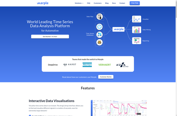
Marple
Marple is an open-source, Markdown-based slide deck tool for creating presentations. It provides a minimalistic editor interface to write slide content in Markdown format, which then gets rendered into an elegant slide deck for presenting.Some key features of Marple:Write slide content in easy-to-read and write Markdown format. Format headings, lists,...
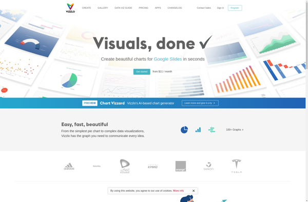
Vizzlo
Vizzlo is an easy-to-use data visualization and infographic software tool that empowers anyone, regardless of design experience, to create beautiful, professional data visualizations, infographics, presentations and reports in just minutes.With an intuitive drag-and-drop interface and access to a massive library of charts, maps, shapes and illustrations, Vizzlo makes it simple...
GGobi
GGobi is an open-source, multi-platform software application for interactive exploratory data analysis. It allows users to visualize high-dimensional datasets by leveraging interactive graphics such as scatterplots, parallel coordinates, star glyphs, time series plots, tours (animation sequences for exploring n-dimensional data spaces), as well as dimension reduction techniques like principal components...

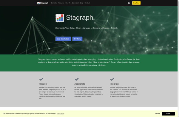
Stagraph
Stagraph is a powerful yet easy-to-use data visualization and analytics platform designed for modern business needs. As a cloud-based solution, Stagraph enables users to effortlessly map, analyze, and gain actionable insights from even the most complex data sets through intuitive drag-and-drop visualizations.Key capabilities and benefits include:Intelligible and interactive data visualizations...
RGraph
RGraph is an open source JavaScript charting library that allows developers to add interactive, customizable charts and graphs to web pages without needing a charting server backend. It is lightweight, easy to implement, and supports over 30 chart types including line, bar, pie, scatter, waterfall, funnel charts and more.Some key...

UvCharts
uvCharts is an open-source JavaScript charting library for building interactive data visualizations for the web. Some key features and benefits of uvCharts include:Open source and completely free to useLightweight at only 15kB gzippedSupports a wide variety of chart types including line, bar, pie, scatter, area charts and moreExtensive customization options...

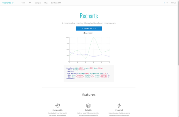
Recharts
Recharts is an open-source React charting library used to build various data visualizations and interactive charts. It is Declarative, Component-Based, and highly customizable to create charts such as line, bar, pie, radar, scatter, treemap and more.Some key features of Recharts:Supports both SVG and Canvas rendering using a unified APIResponsive design...
RAWGraphs
RAWGraphs is a free, open-source web tool created for anyone to easily visualize and share data using the most common graphical formats. The simple drag and drop interface makes it easy for non-experts to quickly generate a wide variety of charts and diagrams that can be exported and shared as...

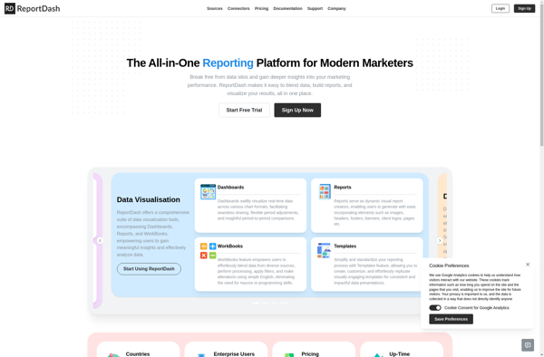
ReportDash
ReportDash is a versatile business intelligence and analytics platform suitable for companies of all sizes. It allows users to connect to various data sources, clean and transform data, and create interactive reports and dashboards that provide actionable insights.Key features include:Intuitive drag-and-drop interface to build reports and dashboards quicklyVariety of customizable...
Datacopia
Datacopia is an open-source data workflow and pipeline tool designed for integrating, moving, and transforming data across databases, data warehouses, lakes, and other systems. It provides an easy to use visual interface to build and manage complex data pipelines without coding.Key features of Datacopia include:Visual data pipeline designer to model...

Chartkick
Chartkick is an open-source charting library for Ruby on Rails applications. It provides a simple domain-specific language for generating interactive charts and graphs without writing any JavaScript. Chartkick supports various chart types like line charts, pie charts, column charts, bar charts and more.Some key features of Chartkick:Easy integration into Rails...

Atlas charts
Atlas charts is a data visualization and business intelligence software that provides an alternative to Tableau. It allows users to create interactive JavaScript charts, dashboards, and reports for data analysis and visualizations. Some key features of Atlas charts include:Drag and drop interface to build charts and dashboards quickly without codingSupport...
Birst
Birst is a cloud-native business intelligence and analytics platform used by enterprises to unify, understand, and act on data. Key capabilities and benefits include:Cloud data warehousing to bring together data from multiple sources for analysisInteractive dashboards and visualizations to spot trends and insightsSelf-service analytics empowering users across the organization to...

Statpedia
Statpedia is a comprehensive online resource for statistics and probability concepts. It features a searchable glossary with over 1,000 clear and concise definitions for statistical terminology along with relevant examples. Topics covered range from the basics of statistics like mean, median, mode, and standard deviation all the way to more...

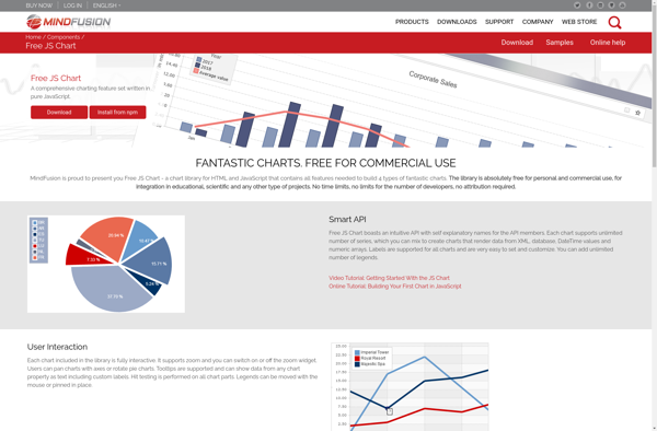
Epoch Charting Library
The Epoch Charting Library is an open-source JavaScript charting library designed for building a wide range of interactive browser-based data visualizations. It provides a simple yet powerful API for defining chart types like bar charts, line charts, scatter plots, pie charts, area plots, and more. The library handles details like...

Free JS Chart
Free JS Chart is an open source JavaScript charting library that allows you to easily create different types of interactive charts and graphs using JavaScript and HTML5 Canvas element. It is completely free to use and customize as per your requirements.Some key features of Free JS Chart:Supports various chart types...
Ember Charts
Ember Charts is an open-source JavaScript charting library built for use in Ember.js applications. It provides a set of reusable Ember components and services to help developers quickly add beautiful, interactive charts and graphs to their apps.Key features of Ember Charts include:Tight integration with Ember's data layer - easily bind...

ArcadiaCharts
ArcadiaCharts is an open-source JavaScript charting library for building interactive data visualizations for the web. With ArcadiaCharts, you can create various types of charts like line charts, bar charts, pie charts, scatter plots, area charts, and more.Some key features and capabilities of ArcadiaCharts include:Support for animation and transitions for more...
Ggvis
ggvis is an R package developed by RStudio for building interactive data visualizations. It allows users to create rich graphics and plots that can be embedded in web pages and applications. Some key features of ggvis include:Builds on the popular ggplot2 graphics package in R, so it is easy for...

Bime
Bime is a flexible business intelligence and analytics platform suitable for modern data teams. It provides an easy way to connect to various data sources like databases, cloud apps, and business software to build interactive dashboards, reports, and analytics.Some key capabilities and benefits of Bime include:Intuitive drag-and-drop interface to visualize...
Chartico
Chartico is a cloud-based data visualization and business intelligence software that allows users to easily create interactive charts, dashboards and reports from their data. Some key features of Chartico include:Drag-and-drop interface to build charts, dashboards and reports visually without codingConnect to data from SQL, MongoDB, Excel, CSVs and other sources...
DataHero
DataHero is a cloud-based business intelligence and analytics platform targeted at non-technical business users. It aims to make BI and data analytics accessible without needing expertise in data science or coding.Key capabilities and benefits of DataHero include:Intuitive drag-and-drop interface to build interactive dashboards and reports visualizing key business metricsConnectors to...

Create a chart online
ChartGo is an intuitive yet powerful online chart maker and graph maker, allowing anyone to easily create professional-looking charts and graphs without any prior experience.With ChartGo, you can quickly visualize your data by choosing one of many chart types including bar charts, pie charts, line graphs, scatter plots, area charts,...
Chart Templates
Chart Templates is charting software that provides a library of pre-designed chart and graph templates that can be customized to visualize data. It helps non-designers easily create professional, on-brand data visualizations for business uses.The software includes hundreds of templates for all types of charts - from basic bar, lines and...

D3plus
D3plus is an open-source JavaScript library that builds on top of D3.js to facilitate the creation of rich, interactive data visualizations and dashboards with minimal code. It was developed to extend the low-level functionality of D3 with higher-level abstractions, intuitive APIs, reusable components and templates to enable faster and easier...

N3-charts
n3-charts is a feature-rich JavaScript charting library for adding interactive data visualizations to web apps and sites. Developed with focus on performance, customizability and ease-of-use, n3-charts allows developers to quickly build various types of charts and graphs to effectively visualize data.With n3-charts, you can create line, bar, column, area, pie,...

AnyChart
AnyChart is a feature-rich JavaScript charting library that enables developers to easily add interactive charts and dashboards to web and mobile applications. With its lightweight architecture, AnyChart aims to provide high performance chart rendering optimized even for large datasets.AnyChart supports over 80 chart types including column, bar, line, area, pie,...

PykCharts.js
PykCharts.js is an open source JavaScript charting library for building highly customizable and interactive data visualizations and charts using web technologies. It is built on top of the popular D3.js library.Key features of PykCharts include:Support for various chart types like line, bar, pie, donut, scatter, bubble maps etc.Interactive charts with...
EJSCharts
EJSCharts is a flexible JavaScript charting library for adding interactive charts and graphs to web applications and sites. It is built on top of the EJ2 JavaScript library and integrates seamlessly with other Syncfusion UI components.With EJSCharts, you can create over 35 chart types including line, area, bar, pie, doughnut,...

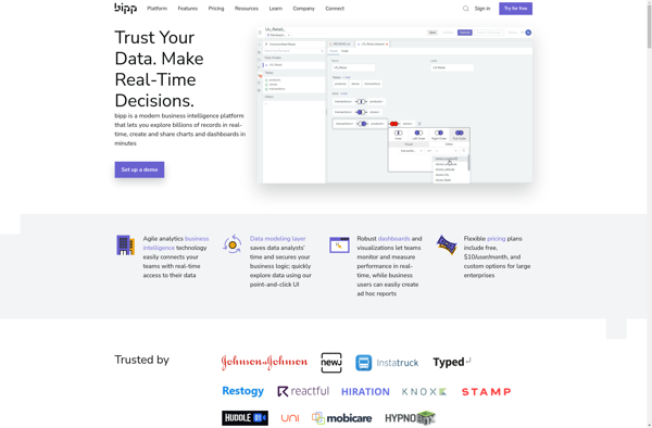
Bipp Analytics
bipp Analytics is a business intelligence and data visualization software that empowers users to connect their data, analyze it visually, and extract meaningful insights. Some key features of bipp Analytics include:Data Connectors - Connect your data from databases, cloud apps, Excel, etc. with pre-built connectors.Interactive Dashboards - Build visually appealing,...
Bouquet
Bouquet is an open-source and free office suite that provides alternatives to Microsoft Office apps like Word, Excel, and PowerPoint. It includes a word processor, spreadsheet program, and presentation software that allows users to create, edit, and share documents, spreadsheets, and slide decks.The word processor, Bouquet Words, provides similar functionality...
BA Apps PREVIEW
BA Apps PREVIEW is a no-code business automation platform designed to empower both technical and non-technical users to build custom business apps and automate workflows without coding. It features an easy-to-use drag-and-drop interface that allows users to quickly design functional apps and set up complex workflows in minutes.Key features include:Intuitive...
CanvasXpress
CanvasXpress is an open-source JavaScript data visualization library designed for interactive data graphing and analysis. It allows researchers and developers to create a wide variety of highly customizable data visualizations including bar charts, pie charts, dot plots, heatmaps, scatter plots, box plots, histograms, line plots, network diagrams and more.Some key...
