DIVE is an open source data visualization application developed by MIT Media Lab. It allows users to easily explore complex data sets and create interactive visualizations such as maps, charts, and graphs.
DIVE is an open source data visualization application developed by MIT Media Lab. It allows users to easily explore complex data sets and create interactive visualizations such as maps, charts, and graphs.
What is DIVE by MIT Media Lab?
DIVE (Data Insight Visualization Explorer) is an open source web application developed by researchers at the MIT Media Lab. It is designed to enable interactive exploration and visualization of complex, multi-faceted datasets.
Some key features of DIVE include:
Intuitive drag-and-drop interface for rapidly building visualizations like maps, charts, graphs, and more
Support for importing diverse datasets in various file formats like CSV, JSON, Excel
Collaborative features for sharing visualizations and annotations
Customizable visual encoding and advanced filtering options
Capabilities for textual and geospatial analysis
Extensibility via custom plugins
DIVE runs entirely in the browser, enabling easy sharing and distribution of data stories. It builds on open web standards like D3.js, Crossfilter, and PostgreSQL to deliver high levels of interactivity and responsiveness. The project is open source under the GPLv3 license.
Overall, DIVE aims to make complex data exploration more accessible to a wider audience. It lowers barriers for creating engaging, interactive stories with data while maintaining depth for power users.
DIVE by MIT Media Lab Features
Features
Interactive data visualization
Drag-and-drop interface
Support for large datasets
Customizable charts, graphs, maps
Collaboration tools
Export visualizations
Pricing
Open Source
Pros
Intuitive and easy to use
Great for exploring and making sense of complex data
Open source and free
Powerful features for data analysis
Active development community
Cons
Steep learning curve for advanced features
Limited customization options compared to commercial tools
Microsoft Power BI is a powerful business analytics service developed by Microsoft. It empowers users to transform raw data into meaningful insights, create interactive reports and dashboards, and share data-driven stories within an organization. Power BI is designed to help businesses and individuals make informed decisions based on a comprehensive...
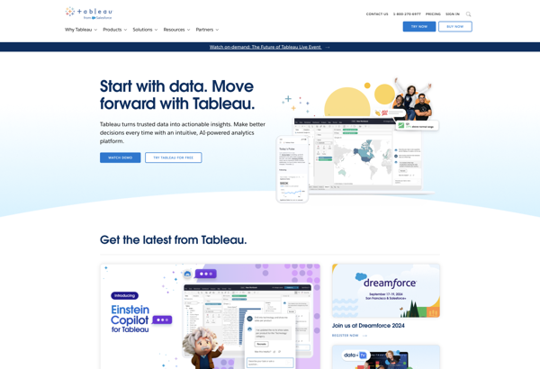
Tableau is a leading business intelligence and data visualization platform used by organizations of all sizes to transform their data into easy-to-understand visualizations and dashboards. With Tableau, users can connect to a wide range of data sources, prepare and clean the data for analysis, and create interactive data visualizations such...
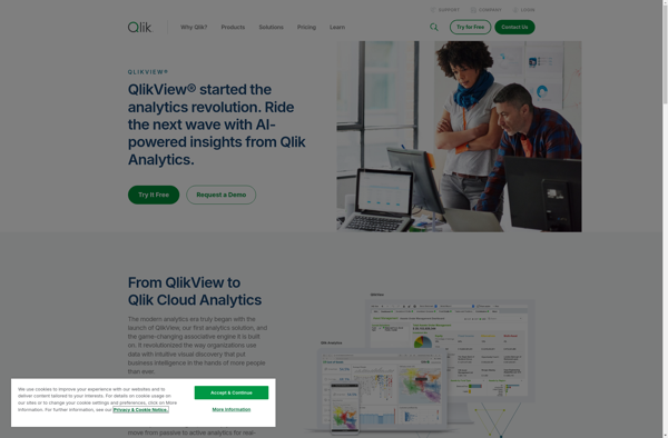
QlikView is a business intelligence and data visualization platform used to create interactive dashboards and analytics applications. It was first released in 1993 by the Swedish company Qlik. Key features of QlikView include:Associative data modeling and in-memory analytics engine - Allows fast analysis of large, disparate datasets without predefined schema...
Plotly is an open-source graphing library that allows users to create interactive, publication-quality graphs, charts, and dashboards. It supports Python, R, JavaScript, and Excel as programming languages. Some key features of Plotly include:Interactive visualization - Plotly charts are interactive with features like hover text, zooming, panning, selectable legends, and editable...
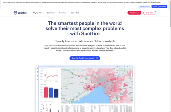
Spotfire is a business intelligence and analytics software platform designed for interactive data discovery and visualization. It enables rapid analysis of large, complex data sets to uncover deeper insights.Key features of Spotfire include:Interactive dashboards and visualizations - Drag-and-drop interface to create customized data visualizations like heat maps, charts, graphs, and...
Sisense is a business intelligence and data analytics software platform designed to help non-technical users prepare, analyze and visualize complex data. Some key features of Sisense include:Intuitive drag-and-drop interface for building interactive dashboards and visualizations like charts, graphs and pivot tables without coding.Ability to connect to wide variety of data...
Many Eyes is a public web application launched in 2007 by IBM Research for visualizing data and creating interactive visualizations. It allows users to upload datasets in various formats, create visualizations like charts, graphs, maps, networks and trees based on the data, and publish them for public viewing and analysis.Some...
Amazon QuickSight is a fast, cloud-powered business intelligence service that makes it easy to build visualizations, perform ad-hoc analysis, and quickly get business insights from your data. Some key features include:Intuitive visual interface that makes it easy to visualize and explore dataBroad data connectivity to connect to data sources like...
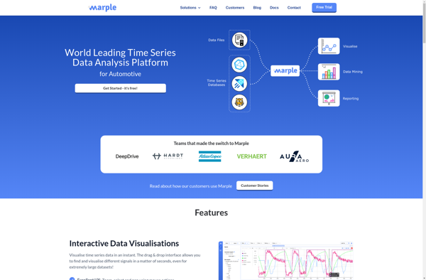
Marple is an open-source, Markdown-based slide deck tool for creating presentations. It provides a minimalistic editor interface to write slide content in Markdown format, which then gets rendered into an elegant slide deck for presenting.Some key features of Marple:Write slide content in easy-to-read and write Markdown format. Format headings, lists,...
RAWGraphs is a free, open-source web tool created for anyone to easily visualize and share data using the most common graphical formats. The simple drag and drop interface makes it easy for non-experts to quickly generate a wide variety of charts and diagrams that can be exported and shared as...