Visuafy is a data visualization and dashboarding software that allows users to create interactive, customizable charts, graphs and dashboards. It has drag-and-drop functionality, supports connections to multiple data sources, and allows data blending from different sources.
Visuafy: Data Visualization and Dashboarding Software
Interactive charts, graphs, and dashboards for customizable data visualization with drag-and-drop functionality, multi-data source connections, and data blending.
What is Visuafy?
Visuafy is a powerful yet user-friendly data visualization and dashboarding platform used by companies and organizations to gain meaningful insights from their data. It allows users without coding skills to create customized, interactive data visualizations including charts, graphs, gauges, maps, and more.
Key features of Visuafy include:
Drag-and-drop interface to easily build visualizations
Broad connectivity to data sources like SQL, NoSQL databases, cloud apps, etc.
Data blending from multiple sources into unified views
Customizable dashboards with filtering and drilling capabilities
Collaboration tools to share insights across teams
Scheduled updates and distribution of reports
Pixel perfect visualizations for print and web viewing
Mobile optimization for viewing dashboards on the go
With robust visualization capabilities, ease of use, and flexibility in connecting to data sources, Visuafy empowers organizations to unlock deep insights from their business data in order to aid faster and better decision-making.
Visuafy Features
Features
Drag-and-drop interface for building visualizations
Supports connections to multiple data sources like SQL, MongoDB, REST APIs
Allows data blending from different sources
Has library of customizable chart types like bar, pie, line, scatter plots etc
Visualizations are interactive and allow drilling down into data
Can create and share interactive dashboards
Pricing
Freemium
Subscription-Based
Pros
Intuitive and easy to use
Great for non-technical users
Good selection of visualization types
Scales to large datasets
Collaboration features like sharing dashboards
Cons
Steep learning curve for advanced features
Limited customization compared to coding visualizations
Plotly is an open-source graphing library that allows users to create interactive, publication-quality graphs, charts, and dashboards. It supports Python, R, JavaScript, and Excel as programming languages. Some key features of Plotly include:Interactive visualization - Plotly charts are interactive with features like hover text, zooming, panning, selectable legends, and editable...
ChartBlocks is a business intelligence and data visualization software used to create interactive charts, dashboards, and reports for better data analysis. It provides an easy drag-and-drop interface to build visualizations quickly without the need for coding.Some key features of ChartBlocks include:Drag-and-drop functionality to create various charts like bar, line, pie,...
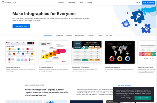
Venngage is a leading visual content creation platform used by individuals and teams to create impactful infographics, presentations, flyers, reports and other visual content. It provides an easy-to-use online editor that allows users to visually create professional graphics and documents in just a few clicks.With Venngage's drag-and-drop interface, users can...
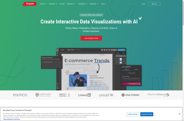
Infogr.am is a user-friendly infographic and data visualization creation software. With an easy drag-and-drop interface, it enables anyone to create sleek, interactive infographics, charts, maps and dashboards in just minutes without coding.Some key features of Infogr.am:Large library of charts and graphs (bar, pie, line, area, scatterplots etc.) to visualize dataInteractive...
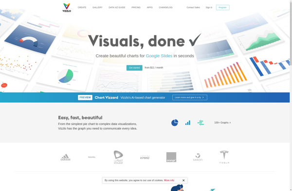
Vizzlo is an easy-to-use data visualization and infographic software tool that empowers anyone, regardless of design experience, to create beautiful, professional data visualizations, infographics, presentations and reports in just minutes.With an intuitive drag-and-drop interface and access to a massive library of charts, maps, shapes and illustrations, Vizzlo makes it simple...
RAWGraphs is a free, open-source web tool created for anyone to easily visualize and share data using the most common graphical formats. The simple drag and drop interface makes it easy for non-experts to quickly generate a wide variety of charts and diagrams that can be exported and shared as...
Charte.ca is a Canadian website that specializes in providing suggestions and comparisons of various software products and online services. Its goal is to help users make informed decisions when choosing software and web applications.The site covers a wide range of categories including creative tools, productivity software, cloud storage, website builders,...
AnyChart is a feature-rich JavaScript charting library that enables developers to easily add interactive charts and dashboards to web and mobile applications. With its lightweight architecture, AnyChart aims to provide high performance chart rendering optimized even for large datasets.AnyChart supports over 80 chart types including column, bar, line, area, pie,...