Datamatic.io
Datamatic.io is a no-code data pipeline builder for ETL and reverse ETL. It allows users to integrate data from multiple sources, transform and clean data, and load it into destinations without writing any code.

Datamatic.io: No-Code Data Pipeline Builder for ETL & Reverse ETL
Discover Datamatic.io, a user-friendly platform for integrating data from various sources, transforming and cleaning data, and loading it into desired destinations without requiring any coding skills.
What is Datamatic.io?
Datamatic.io is a cloud-based no-code data pipeline platform that allows users to build data integration, transformation, and loading processes without needing to write any code. Some key features of Datamatic.io include:
- Graphical interface to visually design data pipelines by connecting various pre-built data source and destination connectors as well as transformation blocks.
- Inbuilt connectivity to 100+ data sources and destinations including databases, data warehouses, SaaS applications, cloud storage, APIs and more.
- Data transformation blocks for joining, filtering, parsing, standardization, validation, enrichment and more to prepare data.
- Scheduling and orchestration capabilities to run pipelines on specified time intervals or triggers.
- Monitoring, logging and alerts to track pipeline runs and data flow through the systems.
- Collaboration features to share, document and manage pipelines across teams.
- Intuitive branching and versioning of pipeline flows for systematic development.
- Secure certified platform compliant with leading data security standards.
Overall, Datamatic.io provides a user-friendly, visual approach to no-code data integration that can improve productivity for IT teams and data analysts.
Datamatic.io Features
Features
- No-code data pipeline builder
- Integrates data from multiple sources
- Transforms and cleans data
- Loads data into destinations
- Supports ETL and reverse ETL
- Graphical user interface for building pipelines
- Scheduling and monitoring of pipelines
- Connectors for popular data sources and destinations
Pricing
- Freemium
- Subscription-Based
Pros
Eliminates the need for coding in data pipeline development
Provides a visual interface for building pipelines
Supports a wide range of data sources and destinations
Offers scheduling and monitoring capabilities
Simplifies the process of data integration and transformation
Cons
May have limited customization options compared to code-based solutions
Potential performance limitations for large-scale or complex data pipelines
Dependency on the platform and its continued development and support
Official Links
Reviews & Ratings
Login to ReviewThe Best Datamatic.io Alternatives
View all Datamatic.io alternatives with detailed comparison →
Top Ai Tools & Services and Data Integration and other similar apps like Datamatic.io
Here are some alternatives to Datamatic.io:
Suggest an alternative ❐Tableau
Tableau is a leading business intelligence and data visualization platform used by organizations of all sizes to transform their data into easy-to-understand visualizations and dashboards. With Tableau, users can connect to a wide range of data sources, prepare and clean the data for analysis, and create interactive data visualizations such...
Google Charts
Google Charts is a robust and flexible JavaScript charting and data visualization library provided for free by Google. It offers developers a highly customizable way to create interactive charts, graphs, and data tables that seamlessly integrate into web pages and applications.With Google Charts, you can visualize complex data sets and...

Plotly
Plotly is an open-source graphing library that allows users to create interactive, publication-quality graphs, charts, and dashboards. It supports Python, R, JavaScript, and Excel as programming languages. Some key features of Plotly include:Interactive visualization - Plotly charts are interactive with features like hover text, zooming, panning, selectable legends, and editable...

Highcharts
Highcharts is an advanced JavaScript charting library used to visualize data and create interactive charts and graphs in web applications. Originally developed in 2009 by Highsoft AS, Highcharts allows developers to quickly add charts and graphs to their web pages with support for a wide variety of chart types out...

D3.js
D3.js, or D3, is an open-source JavaScript library used for visualizing data with web standards. D3 stands for Data-Driven Documents. It allows developers to bind arbitrary data to the Document Object Model (DOM) and then apply data-driven transformations to the document. This allows web developers to create dynamic, interactive data...
NVD3
NVD3 is an open-source JavaScript charting library used to build interactive data visualizations in web browsers. It is based on D3.js and reuses parts of the D3 codebase to create reusable charts. NVD3 aims to simplify and streamline D3 code for faster web development.Some key features of NVD3 include:Over a...

Many Eyes
Many Eyes is a public web application launched in 2007 by IBM Research for visualizing data and creating interactive visualizations. It allows users to upload datasets in various formats, create visualizations like charts, graphs, maps, networks and trees based on the data, and publish them for public viewing and analysis.Some...
Venngage
Venngage is a leading visual content creation platform used by individuals and teams to create impactful infographics, presentations, flyers, reports and other visual content. It provides an easy-to-use online editor that allows users to visually create professional graphics and documents in just a few clicks.With Venngage's drag-and-drop interface, users can...
Piktochart
Piktochart is a web-based graphic design application that makes it simple for non-designers to create professional-looking visual content. Some key features of Piktochart include:Drag-and-drop interface - Easy to use even for those with no design experienceHundreds of templates - Choose from infographics, posters, presentations, social media graphics, and moreIcons, images,...
Infogr.am
Infogr.am is a user-friendly infographic and data visualization creation software. With an easy drag-and-drop interface, it enables anyone to create sleek, interactive infographics, charts, maps and dashboards in just minutes without coding.Some key features of Infogr.am:Large library of charts and graphs (bar, pie, line, area, scatterplots etc.) to visualize dataInteractive...
Easel.ly
easel.ly is an online infographic creation application that makes it simple for anyone to create visually appealing infographics even if they don't have design experience. It provides a drag-and-drop interface along with a large library of templates, shapes, icons, themes, and color schemes that allow users to put together professional-looking...

Keeeb
Keeeb is an open-source, keyboard-focused note taking and productivity app for Windows, Mac and Linux operating systems. It is designed specifically for power users who prefer to use keyboard shortcuts over reaching for the mouse.Some of the key features of Keeeb include:Quick note taking - easily capture thoughts, notes, web...

Marple
Marple is an open-source, Markdown-based slide deck tool for creating presentations. It provides a minimalistic editor interface to write slide content in Markdown format, which then gets rendered into an elegant slide deck for presenting.Some key features of Marple:Write slide content in easy-to-read and write Markdown format. Format headings, lists,...
Vizzlo
Vizzlo is an easy-to-use data visualization and infographic software tool that empowers anyone, regardless of design experience, to create beautiful, professional data visualizations, infographics, presentations and reports in just minutes.With an intuitive drag-and-drop interface and access to a massive library of charts, maps, shapes and illustrations, Vizzlo makes it simple...
RAWGraphs
RAWGraphs is a free, open-source web tool created for anyone to easily visualize and share data using the most common graphical formats. The simple drag and drop interface makes it easy for non-experts to quickly generate a wide variety of charts and diagrams that can be exported and shared as...

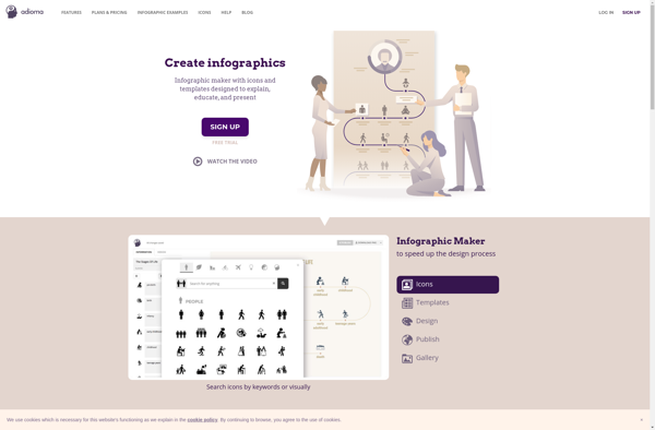
Adioma
Adioma is a cloud-based translation management system designed to help companies manage multilingual content and translation workflows. Some key features of Adioma include:Translation Memory - Stores previously translated content to promote re-use and consistency across translations.Machine Translation Integration - Integrates with machine translation engines like Google Translate for automated translations.Workflow...
Mantle Enterprise Analytics
Mantle Enterprise Analytics is a robust business intelligence and analytics solution catered towards large enterprises. It provides a wide range of capabilities to collect, store, process, analyze, and visualize data across the organization.Key features include:Interactive dashboards and reports for data visualizationPredictive modeling, forecasting, and machine learning algorithmsConnectors to extract data...