Fruit Dashboard

Fruit Dashboard

Fruit Dashboard is a data visualization and business intelligence tool designed specifically for companies in the fruit industry. It allows users to connect multiple data sources, build interactive dashboards and reports, and gain insights into sales, inventory, shipments, and ot
data-visualization business-intelligence dashboard fruit-industry

Fruit Dashboard: Data Visualization and Business Intelligence for Fruit Industry

Fruit Dashboard is a data visualization and business intelligence tool designed specifically for companies in the fruit industry. It allows users to connect multiple data sources, build interactive dashboards and reports, and gain insights into sales, inventory, shipments, and other key metrics.

What is Fruit Dashboard?

Fruit Dashboard is a powerful, easy-to-use business intelligence and data visualization platform built specifically for the fruit industry. Companies of any size can use Fruit Dashboard to connect data from multiple sources, build interactive dashboards and reports, set metrics and KPIs, and gain valuable insights.

With drag-and-drop simplicity, Fruit Dashboard makes it easy for fruit companies to visualize data on sales numbers, inventory levels, shipments, revenue, profits, costs, wastage, and more. Users can create charts, graphs, tables, heat maps and a variety of visualizations to spot trends, identify issues, and support better decision making.

Fruit Dashboard really shines when it comes to inventory management and supply chain optimization. Users can set up real-time alerts and notifications based on inventory metrics, get clarity into shipping and logistics operations, and predict optimal harvest times. This allows fruit businesses to reduce spoilage, operate more efficiently, and ensure optimal cash flow.

Robust collaboration features make it simple for teams to share insights and annotrate reports. And with easy CSV, JSON and API connections, Fruit Dashboard integrates seamlessly with popular data sources and systems like Quickbooks, Shopify, bartenders, and more. Whether you're an executive, analyst, warehouse manager or field worker, Fruit Dashboard provides visibility for your entire fruit operation.

Fruit Dashboard Features

Features

  1. Data visualization
  2. Business intelligence
  3. Interactive dashboards
  4. Custom reports
  5. Sales analytics
  6. Inventory tracking
  7. Shipment tracking
  8. Data integration
  9. KPI monitoring

Pricing

  • Subscription-Based

Pros

Specifically designed for fruit companies

Connects multiple data sources

Interactive dashboards

Customizable reports

Real-time data

Inventory management

Shipment tracking

Data analytics

KPI tracking

Cons

May be too niche for non-fruit companies

Initial setup requires some technical expertise

Not as full-featured as general BI tools

Limited customization compared to open-source BI


The Best Fruit Dashboard Alternatives

Top Business & Commerce and Data Analytics and other similar apps like Fruit Dashboard


Cyfe icon

Cyfe

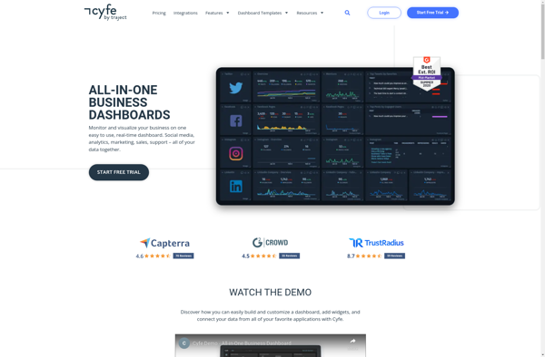
Cyfe is a powerful yet easy-to-use business dashboard and data visualization platform designed to help companies track, analyze, and visualize key performance indicators from all areas of their business. As an all-in-one solution, Cyfe eliminates the need to login to multiple accounts by integrating directly with popular business apps and...
Cyfe image
Freeboard icon

Freeboard

Freeboard is an open-source business intelligence and data visualization software. It provides an intuitive drag-and-drop interface that allows users to visualize data from multiple sources, without needing to code. Some key features of Freeboard include:Connectivity to a variety of data sources like SQL databases, REST APIs, MQTT, and moreLibrary of...
Geckoboard icon

Geckoboard

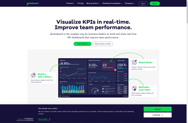
Geckoboard is a cloud-based business intelligence and data visualization platform used by over 30,000 companies worldwide. It allows users to build interactive TV dashboards that bring together data from various sources, both within a company and from external applications, to provide real-time visibility into critical metrics.Geckoboard integrates with 100+ data...
Geckoboard image
Numerics icon

Numerics

Numerics is an open-source data analysis and visualization application designed for engineering, science, finance, and other domains that work with numeric data. It provides a flexible platform for analyzing, transforming, and visualizing numeric datasets of virtually any size and dimension.Some of the key features and capabilities of Numerics include:Importing and...
Numerics image
AppInsights icon

AppInsights

AppInsights is an extensive application performance management (APM) service provided by Microsoft Azure. It allows developers to easily monitor their live web applications and track key metrics like response time, failure rates, dependency rates, and more. Some key capabilities of AppInsights:Monitor response time, failure rates, exceptions to identify performance issues...
AppInsights image
HappyMetrix Dashboards icon

HappyMetrix Dashboards

HappyMetrix Dashboards is a flexible business intelligence and data visualization solution designed to help companies gain insights from their data. It allows users without technical expertise to easily connect multiple data sources, create interactive dashboards and data visualizations, and share insights across the organization.Some key features of HappyMetrix Dashboards include:Drag-and-drop...
HappyMetrix Dashboards image
FinalBoard icon

FinalBoard

FinalBoard is a flexible project management software designed for agile teams. It provides tools to plan projects, break down work into manageable tasks, track progress, and collaborate across teams.Key features of FinalBoard include:Interactive kanban boards to visualize work and track progressCustomizable workflows and automation to match any processFlexible task and...
FinalBoard image