Lightning Design System
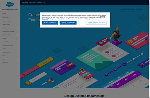
Lightning Design System (LDS)
Open-source component library for Salesforce products, providing reusable components, CSS frameworks, JavaScript, design guidelines, and more for building consistent, accessible web interfaces.
What is Lightning Design System?
The Lightning Design System (LDS) is an open-source design language and component library used to create the user interfaces for Salesforce cloud services and products. LDS provides developers and designers with reusable UI components, patterns, templates, and code to allow them to quickly build consistent, accessible, mobile-first web interfaces that comply with the latest web standards.
Key features and benefits of LDS include:
- Open source - LDS is available under an MIT license on GitHub, allowing anyone to use, customize, and contribute back to the project.
- Reusable components - LDS comes with over 200 built and tested UI components like buttons, navigation, datatables, forms, etc. that have baked-in accessibility and responsive design.
- Design language - Detailed UI design guidelines, branding guidelines, component blueprints, and a style guide provide standards for typography, color, layout, imagery, and more.
- Framework agnostic - LDS components work with popular JS frameworks like React, Angular, and Vue.js as well as plain HTML/CSS/JS.
- Themes - Multiple pre-built themes allow components to match different Salesforce application UIs and branding.
- Active community - As an open source project with contributions from individual developers and major companies, LDS sees frequent updates and additions.
By leveraging the Lightning Design System, developers can save huge amounts of time and resources compared to building UIs from scratch, allowing them to focus on solving business problems vs. reinventing basic components. LDS powers the UIs for Salesforce products used by millions of users worldwide.
Lightning Design System Features
Features
- Reusable UI components
- CSS frameworks
- JavaScript libraries
- Design guidelines
- Accessibility support
- Responsive design
- Theming and branding
- Documentation
Pricing
- Open Source
Pros
Cons
Official Links
Reviews & Ratings
Login to ReviewThe Best Lightning Design System Alternatives
View all Lightning Design System alternatives with detailed comparison →
Top Development and Ui Framework and other similar apps like Lightning Design System
Here are some alternatives to Lightning Design System:
Suggest an alternative ❐
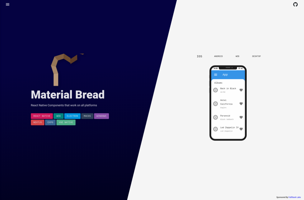
Material Bread
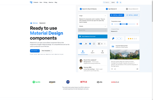
Material UI
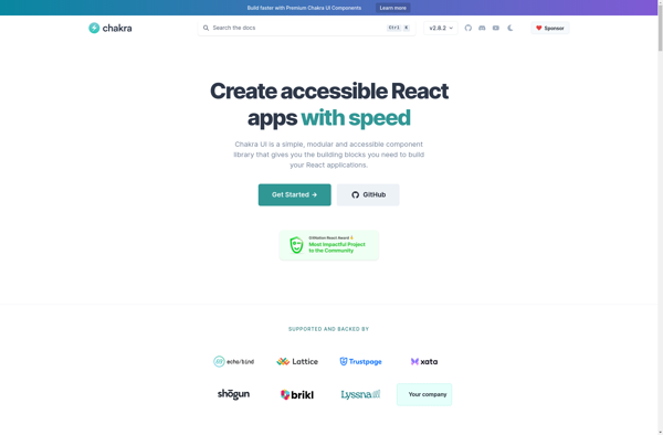
Chakra UI
Ant Design
Reakit
BlueprintJS
UIkit

Elastic UI
Semantic UI
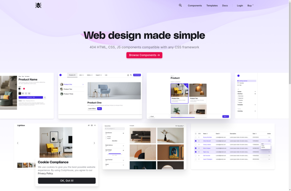
CodyHouse
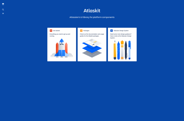
Atlaskit
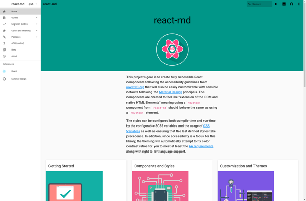
React-md