Atlaskit
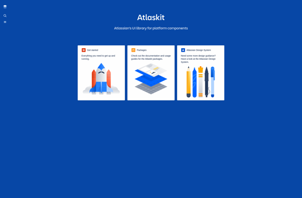
Atlaskit: Open-Source UI Library for Faster Product Development
Atlaskit is an open-source UI library created by Atlassian. It provides React components to help developers build products faster while ensuring consistency and accessibility. Key components include buttons, forms, modals, and more.
What is Atlaskit?
Atlaskit is an open-source UI library created and maintained by Atlassian to build products faster and with consistency. It contains dozens of reusable React components that help developers ensure accessibility, reduce bugs, and spend more time on business logic rather than building UIs from scratch.
Some of the key benefits of Atlaskit include:
- Open source - the code is available on Bitbucket for the community to use and contribute to.
- Consistent design - components follow Atlassian design guidelines out of the box.
- Accessible - supports WAI-ARIA standards for user accessibility.
- Extensible - build custom components on top of existing foundations.
- Popular components - buttons, forms, modals, input fields, and more.
- Theming - customizable styling via theming API.
- TypeScript - written in TS providing auto-completions.
- Lightweight - no heavy dependencies, optimized bundle sizes.
Atlaskit helps developers build Atlassian-flavored UIs faster for their products. Instead of having to build common components from scratch, they can focus on app-specific logic and take advantage of Atlaskit's thoughtfully-designed foundational components.
Atlaskit Features
Features
- React UI components
- Accessible and responsive design
- Common UI patterns
- Theming and styling
- Documentation and examples
Pricing
- Open Source
Pros
Cons
Official Links
Reviews & Ratings
Login to ReviewThe Best Atlaskit Alternatives
View all Atlaskit alternatives with detailed comparison →
Top Development and Ui Libraries and other similar apps like Atlaskit
Here are some alternatives to Atlaskit:
Suggest an alternative ❐
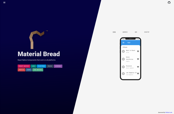
Material Bread
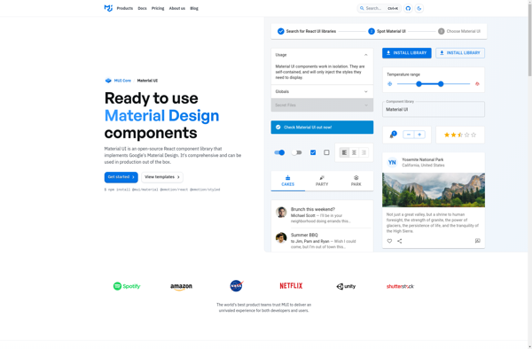
Material UI
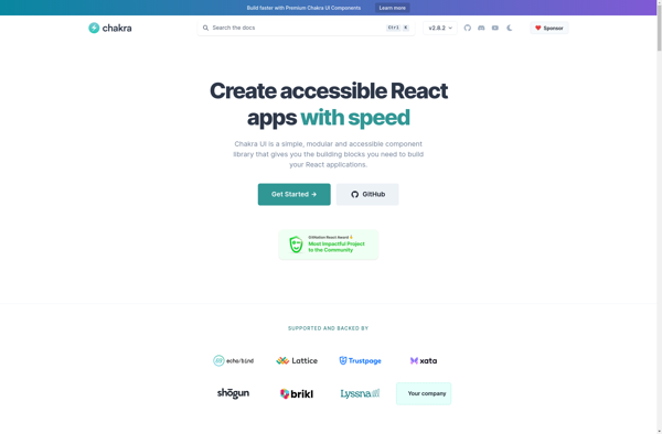
Chakra UI
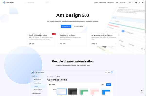
Ant Design
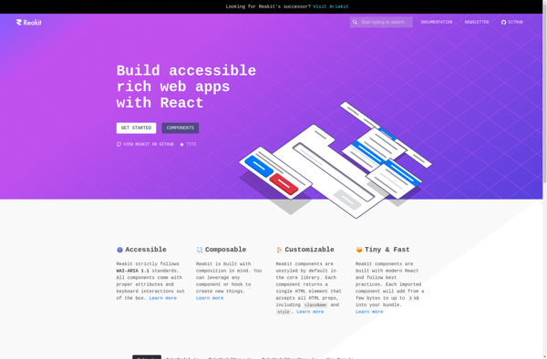
Reakit
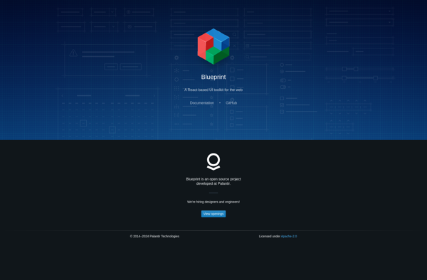
BlueprintJS
UIkit

Elastic UI
Semantic UI
Lightning Design System
React-md