InfoCaptor Dashboard
InfoCaptor Dashboard is a data analytics and business intelligence platform that allows users to consolidate data from multiple sources, create interactive dashboards and reports, and gain insights. It has customizable widgets, drag-and-drop functionality, and collaboration featu

InfoCaptor Dashboard: Data Analytics and Business Intelligence Platform
Data analytics and business intelligence platform for consolidating data from multiple sources, creating interactive dashboards and reports, with customizable widgets, drag-and-drop functionality, and collaboration features.
What is InfoCaptor Dashboard?
InfoCaptor Dashboard is a business intelligence and analytics platform designed to help companies consolidate their data, create customized dashboards and reports, and uncover valuable insights. Some key features of InfoCaptor Dashboard include:
- Data connectivity and ETL - Connect to data from multiple sources like SQL and NoSQL databases, cloud apps, Excel, etc. Clean, transform and load data for analysis.
- Interactive dashboards - Build interactive dashboards with drag-and-drop widgets like charts, tables, cards, maps and more. Filter, drill down and customize as per needs.
- Ad hoc reporting - Create reports with parameters and controls for users to self-serve analytics and export to various file formats.
- Visual data discovery - Visually explore data relationships with features like trend analysis, forecasting, outlier detection, correlations etc.
- Alerting and scheduling - Set up alerts and schedule automatic report generation and distribution via email, slack or third party apps.
- Access control and collaboration - Manage access and permissions at user, role and artefact levels. Annotate and discuss on dashboard elements.
With an intuitive interface, pre-built templates and enterprise-grade governance capabilities, InfoCaptor Dashboard enables businesses to democratize data access for faster and better decisions.
InfoCaptor Dashboard Features
Features
- Consolidate data from multiple sources
- Create interactive dashboards and reports
- Gain insights through data analytics
- Customizable widgets
- Drag-and-drop functionality
- Collaboration features
Pricing
- Subscription-Based
- Pay-As-You-Go
- Custom Pricing
Pros
Intuitive and easy to use interface
Real-time data analytics
Flexible reporting and dashboard creation
Scales to large data volumes
Integrates with many data sources
Strong collaboration and sharing capabilities
Cons
Can be expensive for smaller businesses
Steep learning curve for advanced features
Limited custom coding options
Relies heavily on pre-built templates
May lack some niche analytics functions
Official Links
Reviews & Ratings
Login to ReviewThe Best InfoCaptor Dashboard Alternatives
View all InfoCaptor Dashboard alternatives with detailed comparison →
Top Business & Commerce and Business Intelligence & Analytics and other similar apps like InfoCaptor Dashboard
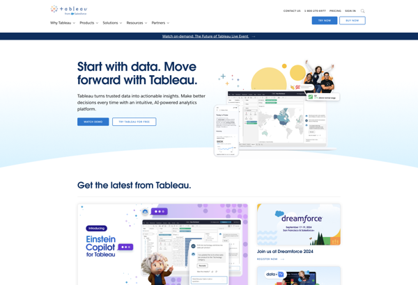
Tableau
Tableau is a leading business intelligence and data visualization platform used by organizations of all sizes to transform their data into easy-to-understand visualizations and dashboards. With Tableau, users can connect to a wide range of data sources, prepare and clean the data for analysis, and create interactive data visualizations such...
QlikView
QlikView is a business intelligence and data visualization platform used to create interactive dashboards and analytics applications. It was first released in 1993 by the Swedish company Qlik. Key features of QlikView include:Associative data modeling and in-memory analytics engine - Allows fast analysis of large, disparate datasets without predefined schema...
Alteryx
Alteryx is a data preparation and analytics software platform designed to make advanced data analytics accessible to any data worker. It provides an end-to-end platform to ingest, prepare, blend, analyze, and visualize data to gain deeper insights faster.Some key capabilities and benefits of Alteryx include:Intuitive drag-and-drop interface to prep and...
Pentaho
Pentaho is a comprehensive open source business intelligence (BI) suite that provides a range of data integration, analytics, visualization, reporting, data mining, and workflow capabilities. It is designed to help businesses consolidate data from disparate sources for unified analytics and reporting.Some of the key capabilities and components of Pentaho include:Data...
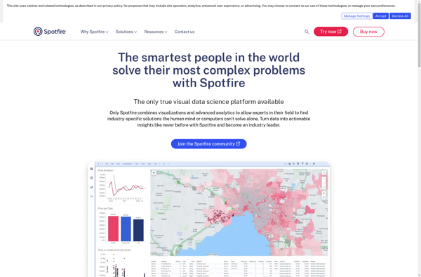
Spotfire
Spotfire is a business intelligence and analytics software platform designed for interactive data discovery and visualization. It enables rapid analysis of large, complex data sets to uncover deeper insights.Key features of Spotfire include:Interactive dashboards and visualizations - Drag-and-drop interface to create customized data visualizations like heat maps, charts, graphs, and...
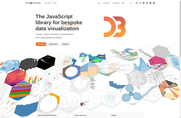
D3.js
D3.js, or D3, is an open-source JavaScript library used for visualizing data with web standards. D3 stands for Data-Driven Documents. It allows developers to bind arbitrary data to the Document Object Model (DOM) and then apply data-driven transformations to the document. This allows web developers to create dynamic, interactive data...
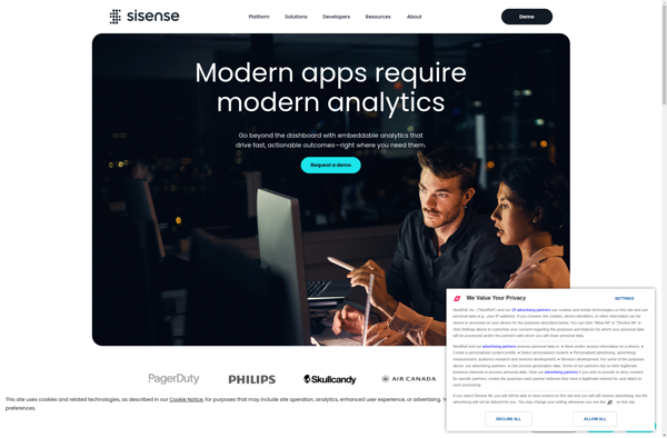
Sisense
Sisense is a business intelligence and data analytics software platform designed to help non-technical users prepare, analyze and visualize complex data. Some key features of Sisense include:Intuitive drag-and-drop interface for building interactive dashboards and visualizations like charts, graphs and pivot tables without coding.Ability to connect to wide variety of data...
QueryTree
QueryTree is a visual SQL analytics software designed to make query building fast and easy for any skill level. It features an intuitive drag-and-drop interface that allows users to construct complex SQL queries visually without typing code.Some key features of QueryTree include:Visual query builder with drag-and-drop fields and quick type...

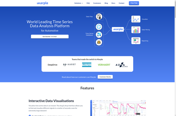
Marple
Marple is an open-source, Markdown-based slide deck tool for creating presentations. It provides a minimalistic editor interface to write slide content in Markdown format, which then gets rendered into an elegant slide deck for presenting.Some key features of Marple:Write slide content in easy-to-read and write Markdown format. Format headings, lists,...
KiniMetrix
KiniMetrix is a cloud-based software platform designed for healthcare providers to help them better manage their practices, engage with patients, gain population health insights, and handle administrative tasks. It combines features typically found in separate electronic health record (EHR), practice management, patient portal and business intelligence solutions into one unified...
AnyChart
AnyChart is a feature-rich JavaScript charting library that enables developers to easily add interactive charts and dashboards to web and mobile applications. With its lightweight architecture, AnyChart aims to provide high performance chart rendering optimized even for large datasets.AnyChart supports over 80 chart types including column, bar, line, area, pie,...

Jolicharts
Jolicharts is a feature-rich JavaScript charting library that allows you to easily add interactive charts and graphs to web applications and dashboards. With Jolicharts, you can create over 30 types of charts including line charts, bar charts, pie charts, scatter plots, stacked bar charts and more.Some key features of Jolicharts...