Simple Grid
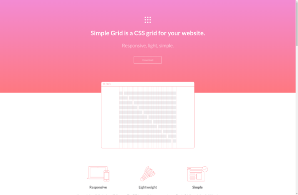
Simple Grid: Open-Source CSS Grid Framework for Responsive Web Design
A lightweight grid system for building layouts with intuitive class names, Simple Grid provides a simple and responsive solution for web designers.
What is Simple Grid?
Simple Grid is an open-source, responsive CSS grid framework designed for quickly building layouts and responsive websites without the overhead of complex CSS frameworks. It uses flexbox and a mobile-first approach to create intuitive, flexible grid columns with minimal configuration.
Some key features of Simple Grid include:
- Lightweight at under 3kb minified and gzipped
- Mobile-first 12 column fluid grid supporting responsive layouts
- Easy syntax - just add a class like .col-1-3 to take up 1/3 of the space
- Nesting - grid columns can be nested to create complex designs
- No external dependencies - it's just a simple CSS file to include
- Good browser support including IE10+
- MIT license - free to use on personal or commercial projects
Because of its small size and simplicity, Simple Grid is a good option for websites like blogs, portfolios, and other sites focused on content that don't require complex interfaces. The easy class names reduce the need to write custom CSS while providing a full featured, responsive grid.
Simple Grid Features
Features
- Responsive grid system
- Lightweight CSS framework
- Intuitive class names
- Open source & free
Pricing
- Open Source
- Free
Pros
Cons
Official Links
Reviews & Ratings
Login to ReviewThe Best Simple Grid Alternatives
View all Simple Grid alternatives with detailed comparison →
Top Development and Web Development and other similar apps like Simple Grid
Here are some alternatives to Simple Grid:
Suggest an alternative ❐
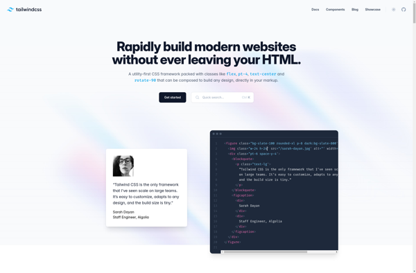
Tailwind CSS
Materialize

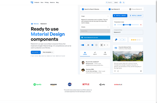
Material UI
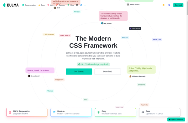
Bulma
UIkit

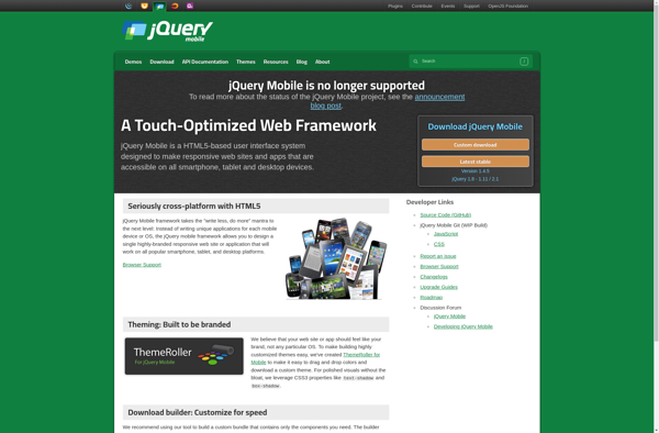
JQuery Mobile
Tailwind UI

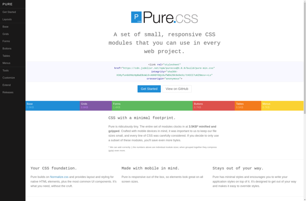
Purecss
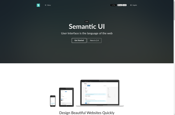
Semantic UI
Topcoat