Susy
Susy: Responsive CSS Framework
Susy is a lightweight and responsive CSS framework that makes it easy to build responsive layouts. It uses Sass to provide a syntax for easily declaring responsive layouts. Susy helps web developers quickly build flexible, customizable layouts that adapt to multiple screen sizes.
What is Susy?
Susy is an open-source, lightweight and responsive CSS framework for quickly building adaptive web layouts. It provides a flexible grid system and a set of Sass mixins that make it easy to declare fluid grids, columns, gutters, and more in your SCSS code.
Some key features of Susy include:
- Flexible grids - Easily configure a responsive grid with the number of columns, column and gutter widths, layout direction, and more.
- Media queries - Susy can generate media queries for your breakpoints automatically.
- Lightweight - Only outputs the CSS you need for your declared layouts.
- Customizable - Change grid settings per-layout or even per-section as needed.
- Sass-based - Uses native Sass features for easy configuration in your Sass/SCSS stylesheet.
- Good browser support - Works with all modern browsers including IE9 and up.
Susy is a great choice if you want an easy way to build responsive, flexible grid layouts from Sass without having to write all the complex CSS yourself. Its focus on customization and small file size make it suitable for use in most web development projects.
Susy Features
Features
- Lightweight and responsive CSS framework
- Makes it easy to build responsive layouts
- Uses Sass for declaring responsive layouts
- Helps build flexible, customizable layouts
- Adapts to multiple screen sizes
Pricing
- Open Source
Pros
Cons
Official Links
Reviews & Ratings
Login to ReviewThe Best Susy Alternatives
View all Susy alternatives with detailed comparison →
Top Development and Css Frameworks and other similar apps like Susy
Here are some alternatives to Susy:
Suggest an alternative ❐
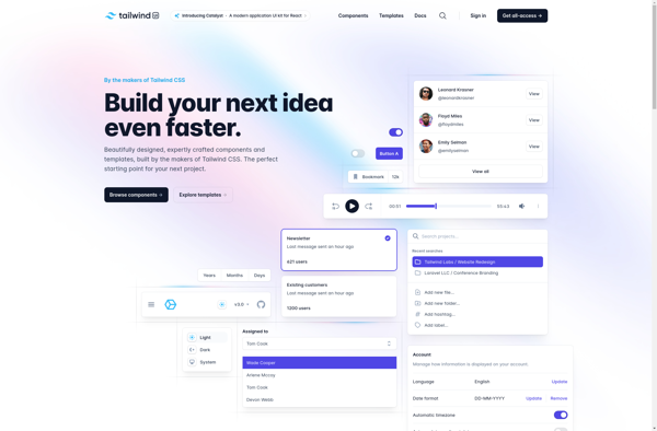
Tailwind CSS
Materialize
Material UI
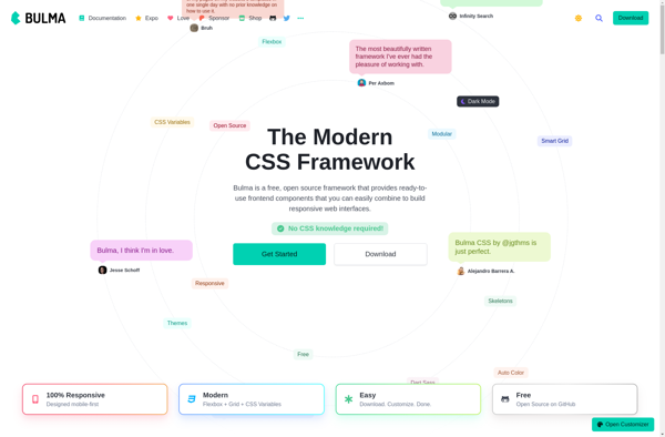
Bulma
UIkit

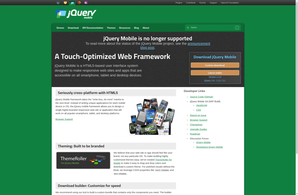
JQuery Mobile
Tailwind UI
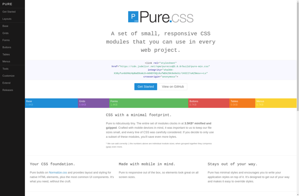
Purecss
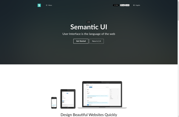
Semantic UI
Topcoat
